Team Project
KingNet
Intranet redesign for City of Kingston, Canada
Background
The City of Kingston commissioned a project to redesign their internal website, KingNet, with the aim of improving internal communication and employees' success. The existing website was primarily used for submitting service tickets and accessing other services, but the City sought to create a more centralised hub making resources and services easy to locate. The ultimate goal was to increase employee engagement and have them access KingNet as a valuable communication tool — not out of necessity. My tasks included task/date organisation, meeting notes, literature review, survey analysis, interview/feedback note-taking, designing support-related pages, creating and modifying page versions, and usability testing. Desktop-based project. Tools: Figma, surveys, interviews, feedback sessions.
Project Goals
Redesign the landing page and support pages with a focus on frontline workers to create a better user experience. Business goals City of Kingston wanted to achieve:
- Main channel of communication
- Increase engagement
- Centralized access
- Main resource for information
- News & Communications portal
- Corporate Job Board & Org chart
- Efficient and customizable UI
- Analytics and access to data
- Employee surveys
Research — Competitive Research
We conducted a comprehensive competitive analysis to gain insights into competitor design patterns, structures, and best practices — to understand the competition and how KingNet could differentiate.
- Two-panel design is being used
- Some customization for the layout
- Divide home page real estate
- Personal / Department functions
- Indicate the current page
- Customized region, Knowledge area, News area, Spotlight area, Firm-wide calendar
Research — Literature Review
Reviewed existing literature on intranet website design for the latest design trends, usability standards, and user experience.
- An intranet should increase engagement
- Follow patterns like 80/20, 60/30/10 colour rules and IA principles
- Avoid deep, unclear global navigation
- Allow global search, different link labels, indicate the current page
Research — Survey
15 frontline workers surveyed about user goals and favourite features. Key findings:
- KingNet is not a part of the main communication channels
- Favourite things are often external platforms, not on the intranet
- People prefer not to use KingNet if not completely necessary
- Quick links are useful and preferred
- Nobody uses the top navigation bar
- Not everyone can access KingNet
Research — Interviews
3 participants (2 stakeholders, 1 frontline worker). Frontline workers and stakeholders had very different views on KingNet, but getting support was a huge thing, so I created a dedicated support page to reduce user headaches.
- Landing — space not utilised efficiently; quick links useful; outdated styles uncomfortable; quick access to support needed; polish News/Announcements
- Support — all use Service Desk mainly; forms hard to find; offline methods more efficient; facilities pages rarely used; FAQs lacking; users do not know where to ask
1st Wireframe
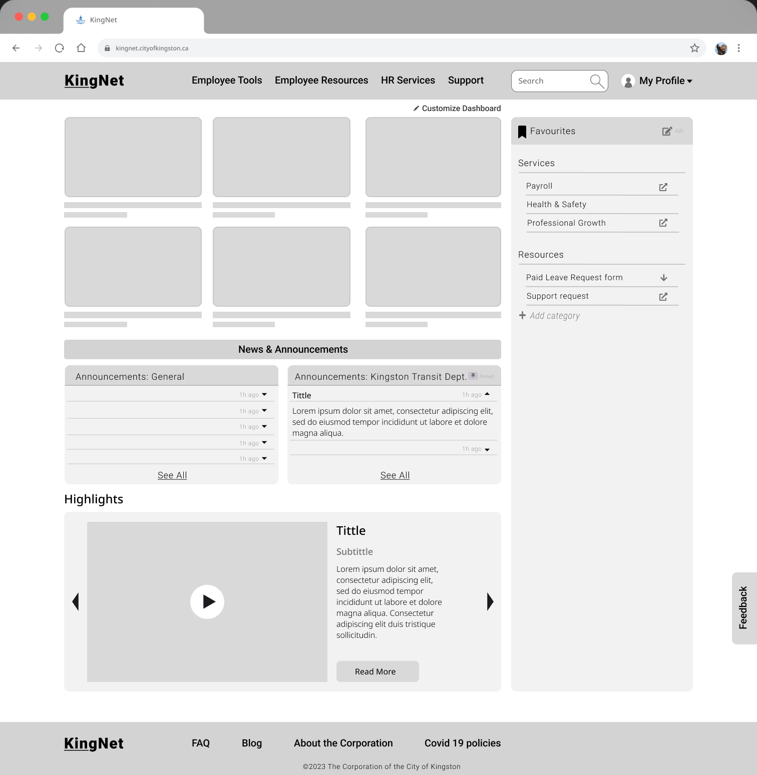
Stage focused on the layout of the pages, extra pages, and content additions based on the survey.
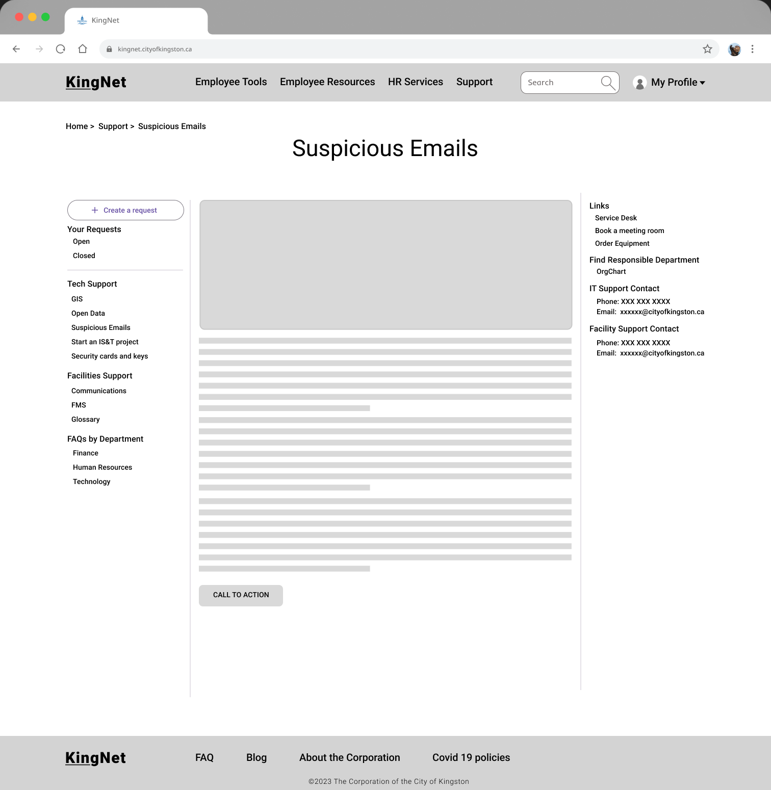
2nd / 3rd Wireframe
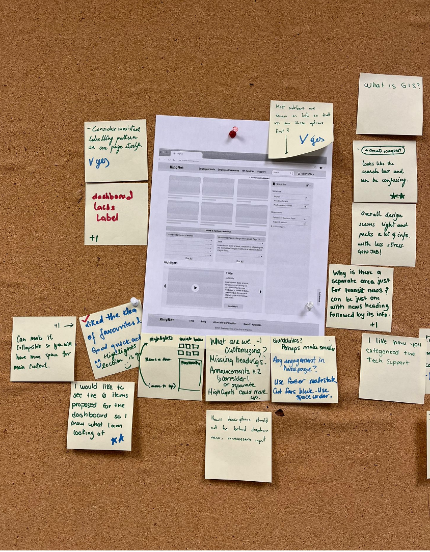
Stage focused on location and display of elements, and gathered feedback on the initial wireframe. We conducted 2 one-hour feedback sessions with 2 stakeholders and 2 frontline workers.
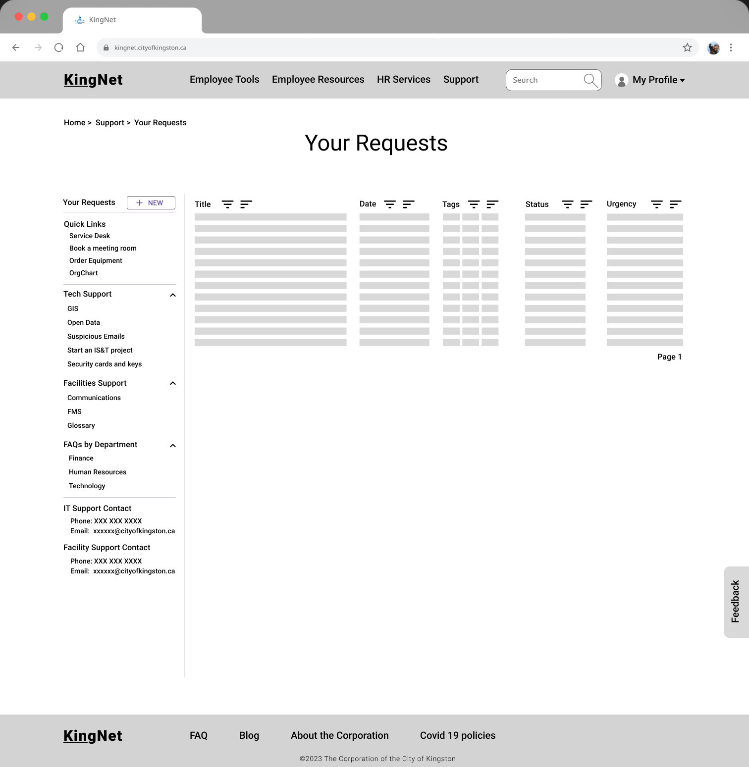
A/B Testing — Option A
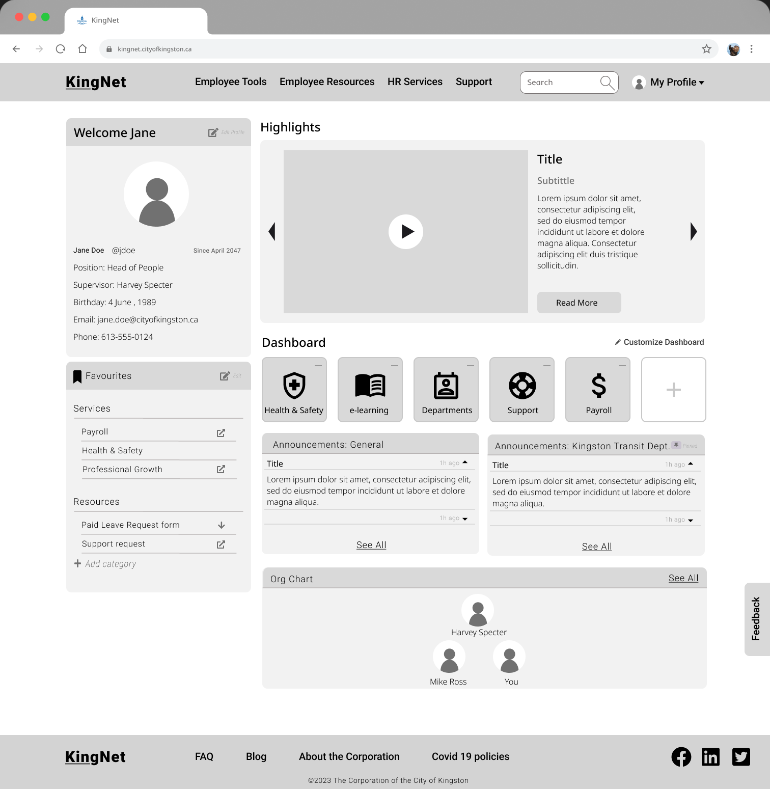
A/B Testing — Option B
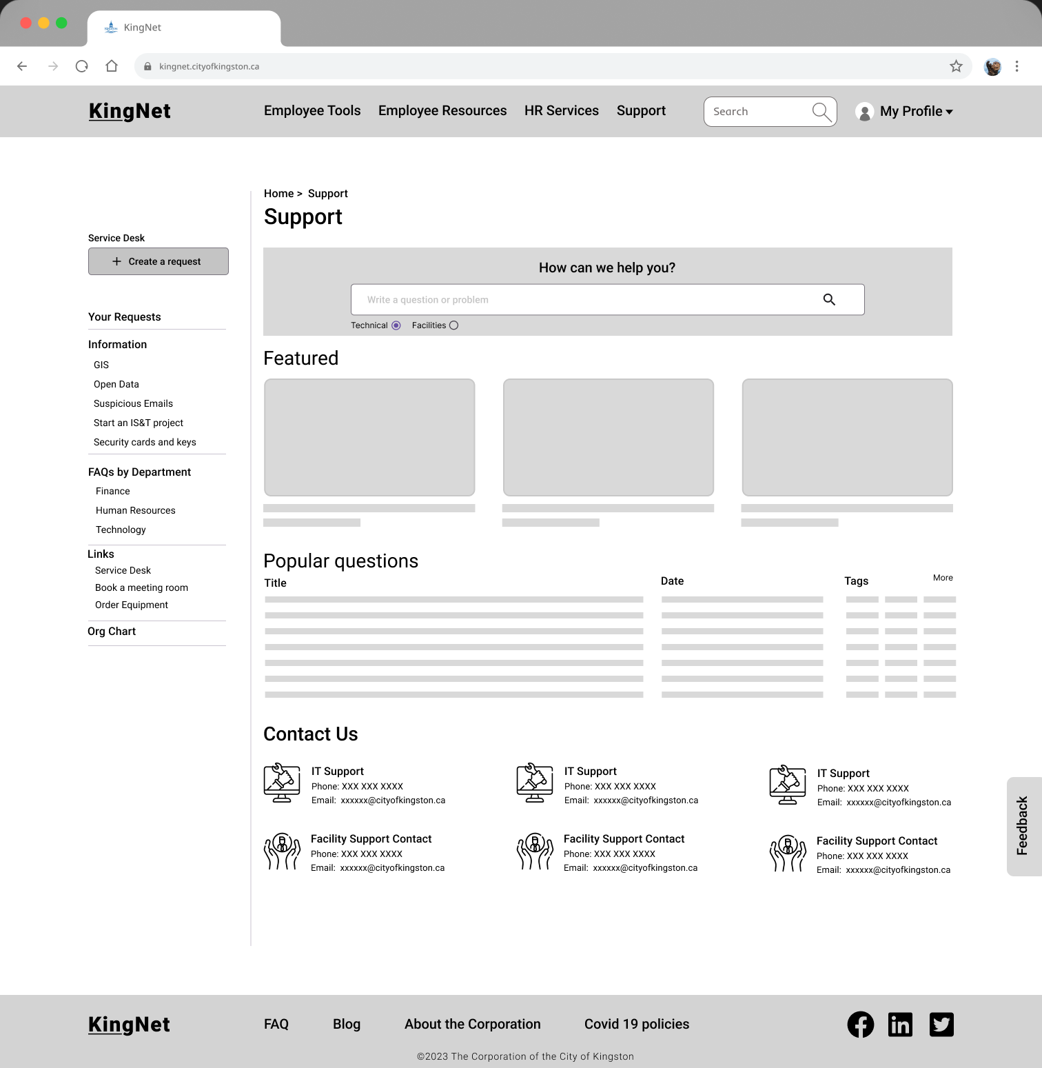
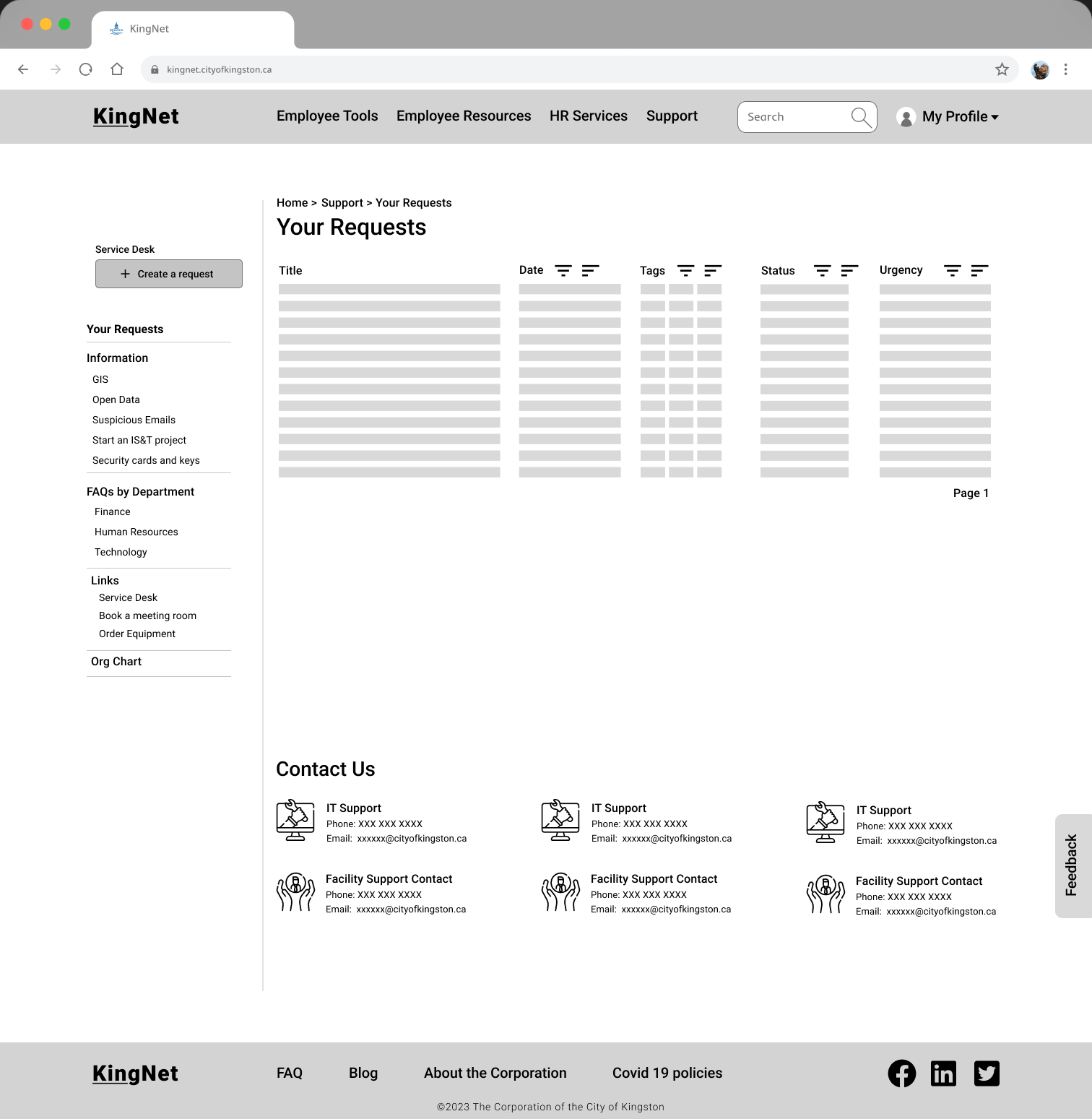
A/B Findings
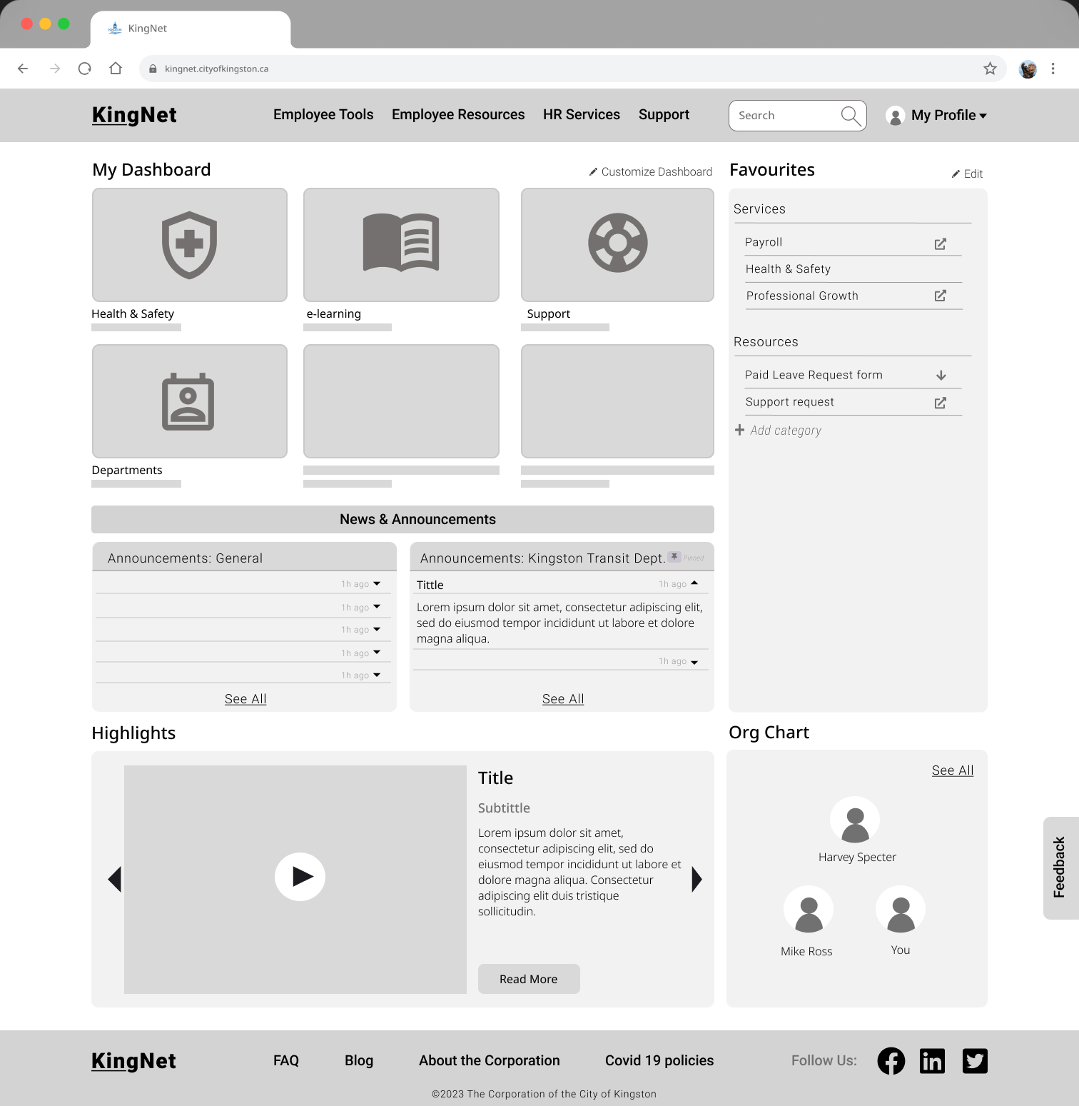
- Landing — straightforward and clean is needed; optimized use of space; Org chart is a must; New Hires/Jobs nice to have
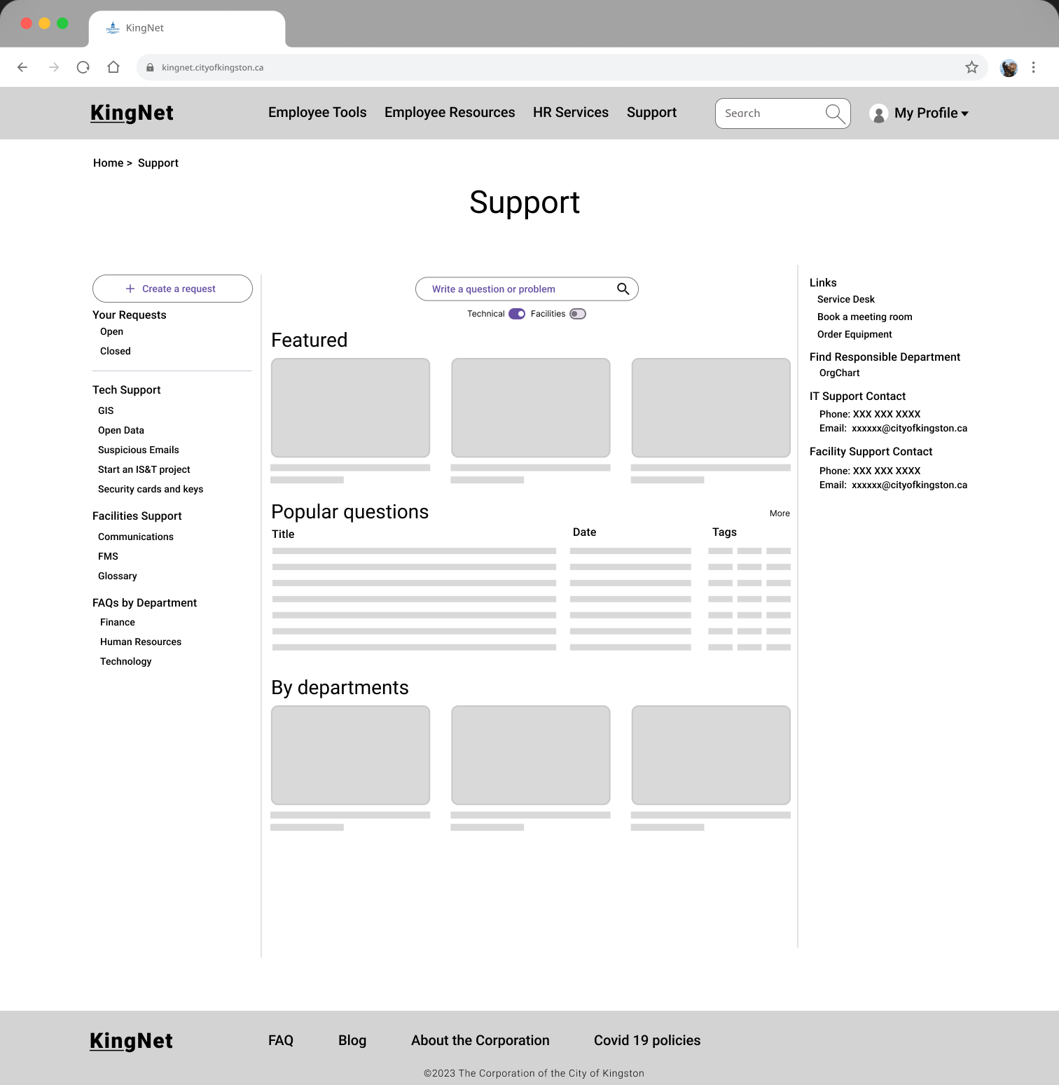
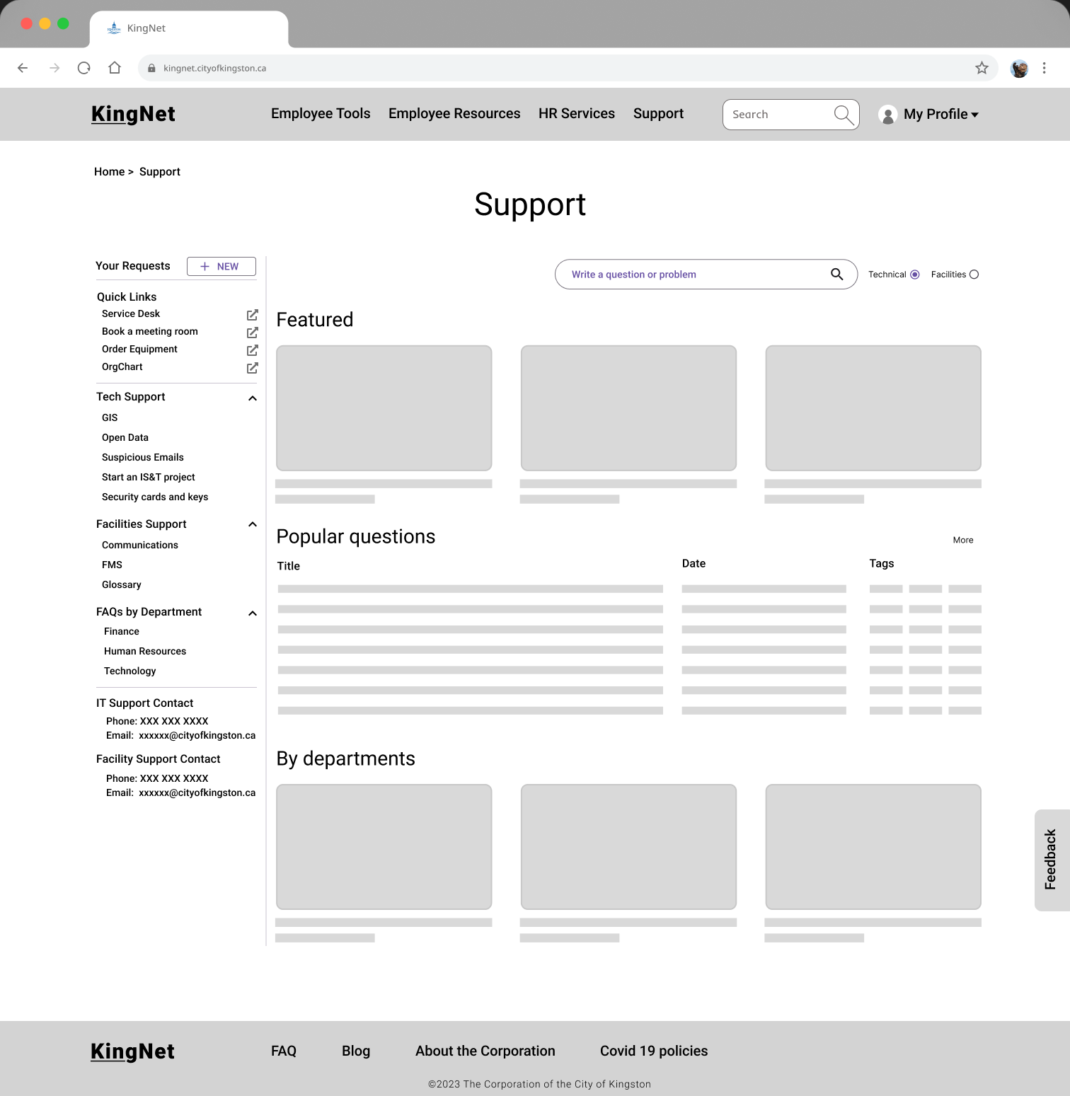
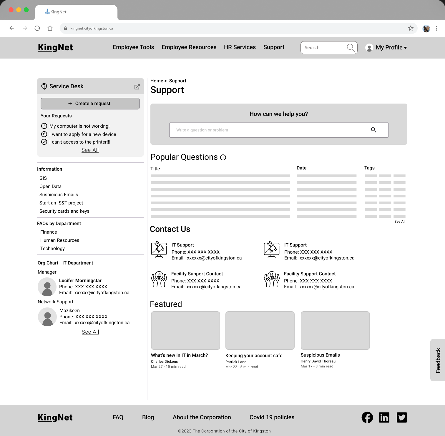
- Support — prominent search useful; filter unnecessary (tech vs facilities handled separately); make "Create a request" more prominent
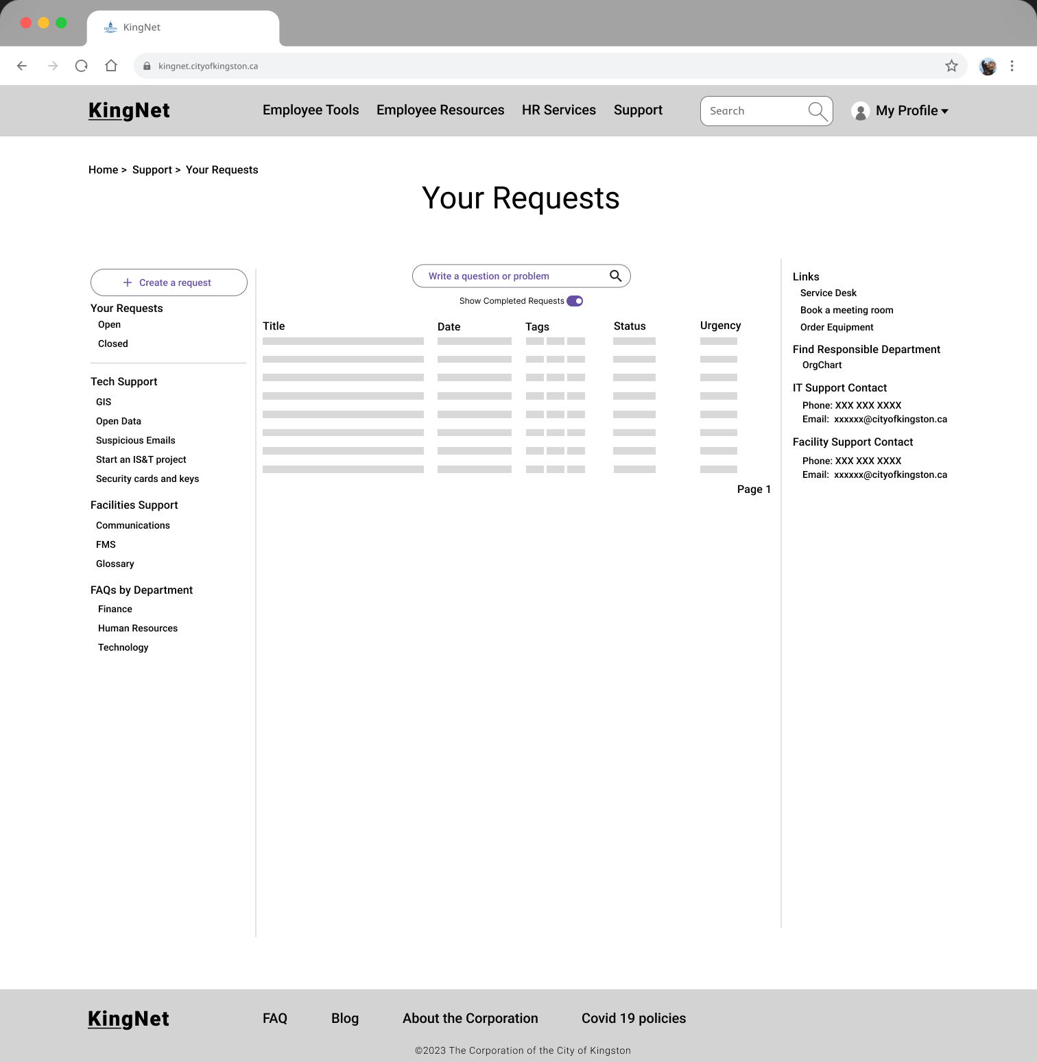
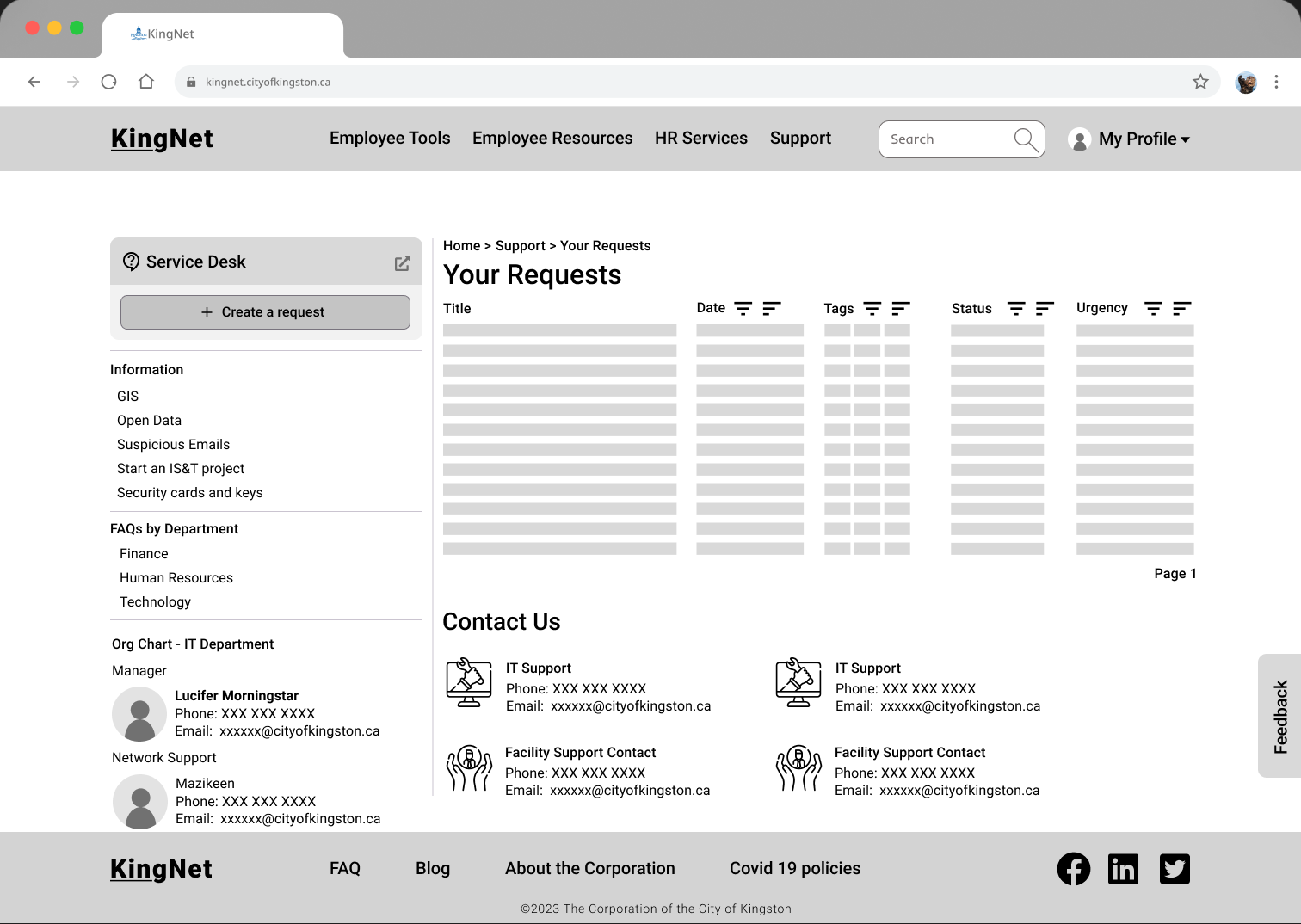
- Your Requests — clean enough
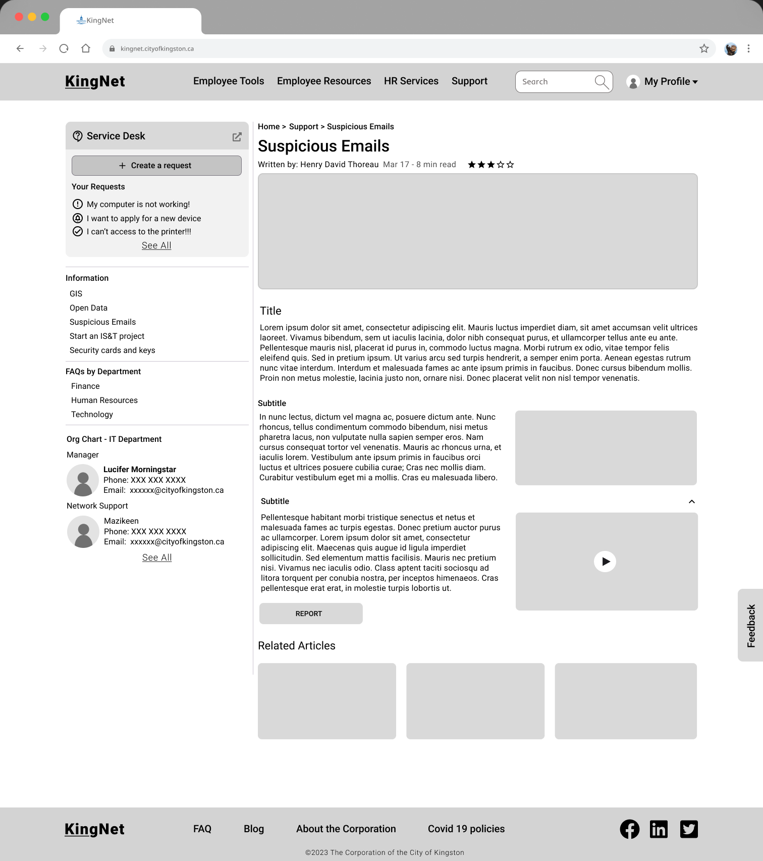
- Article — good info; add related articles section; collapsible sub-sections; media good
Final design at this stage
Final Prototype — Landing Page
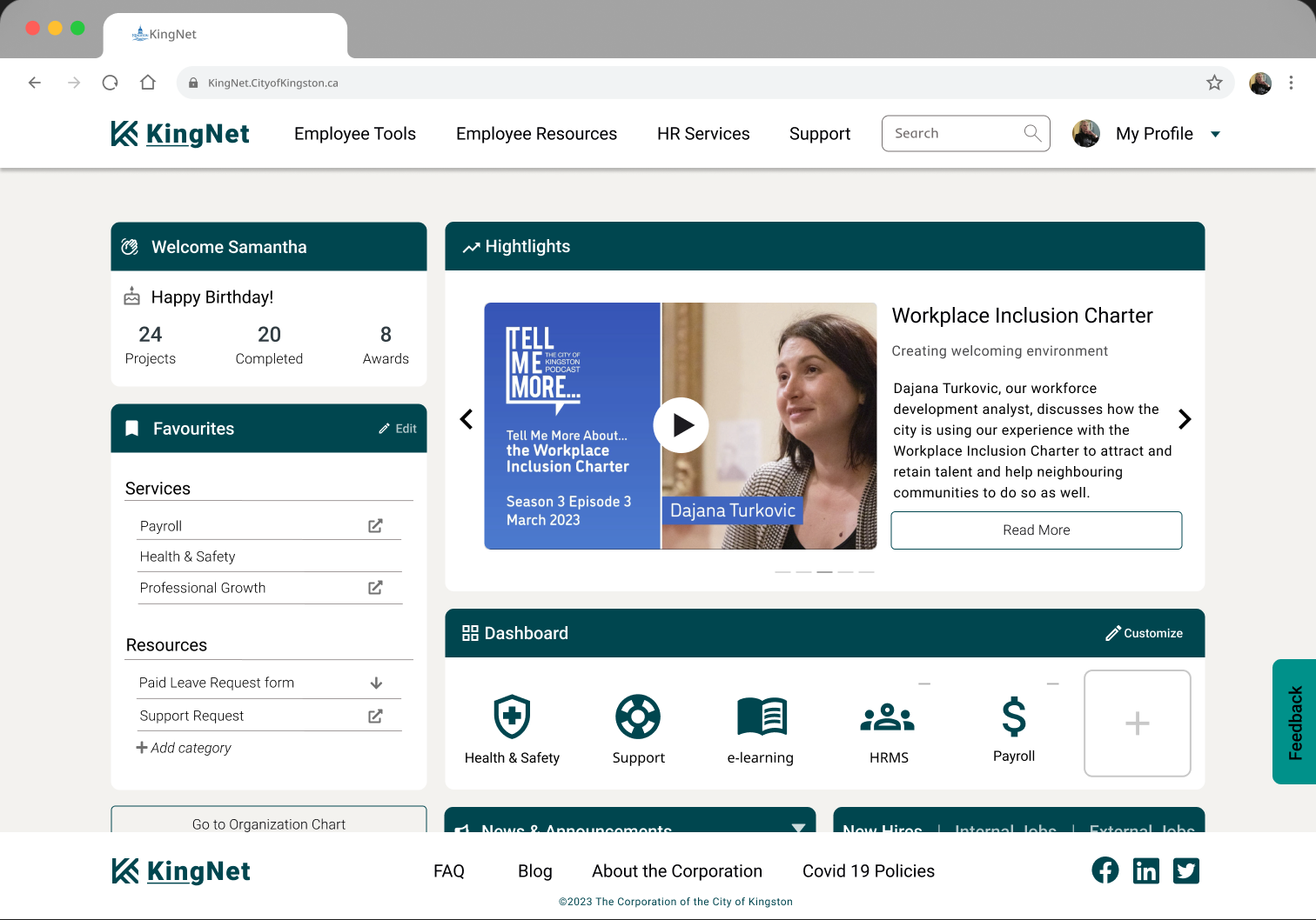
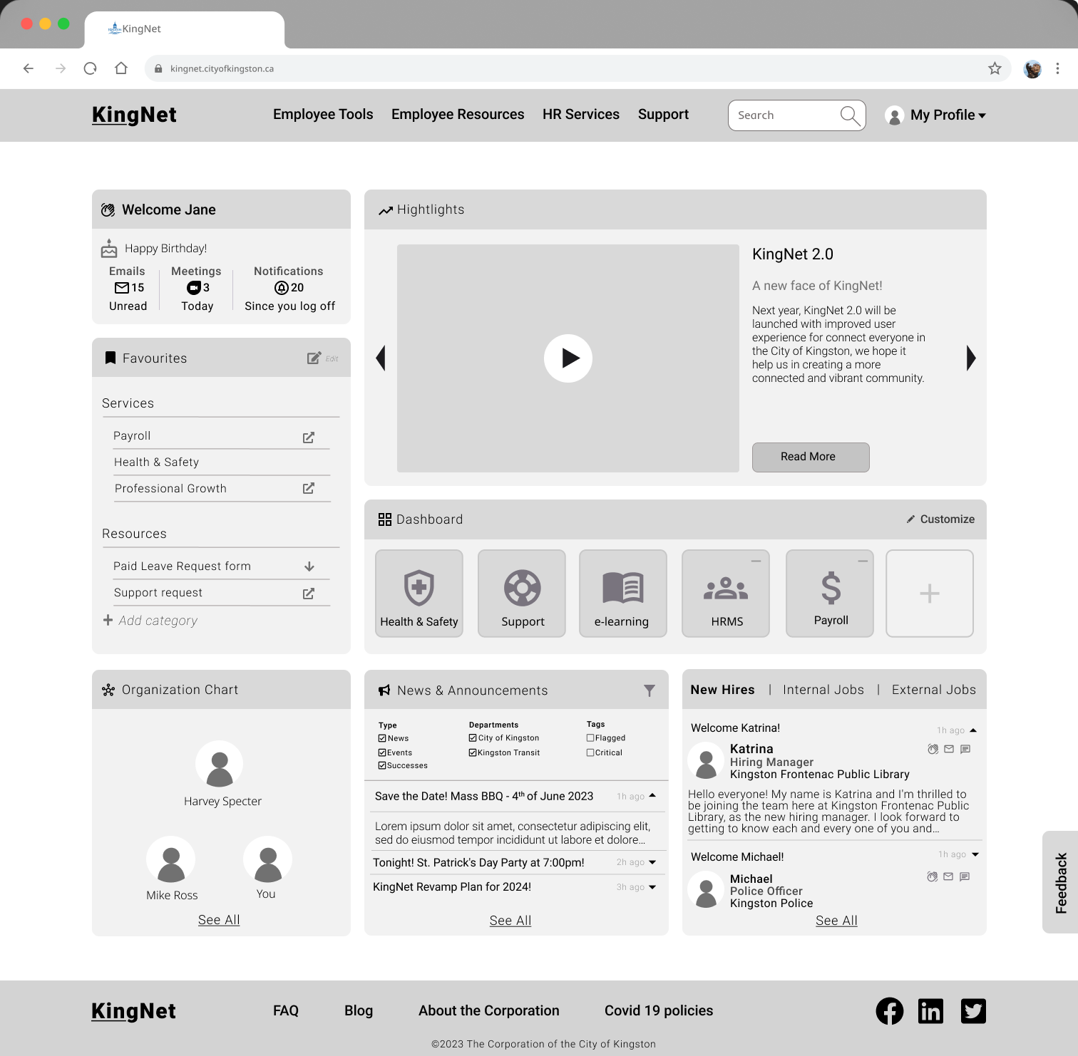
The landing page provides quick and easy access to information employees need regularly: welcome widget, favourites, organisation chart, polling, highlights, dashboard, news & announcements, and new hires & jobs.
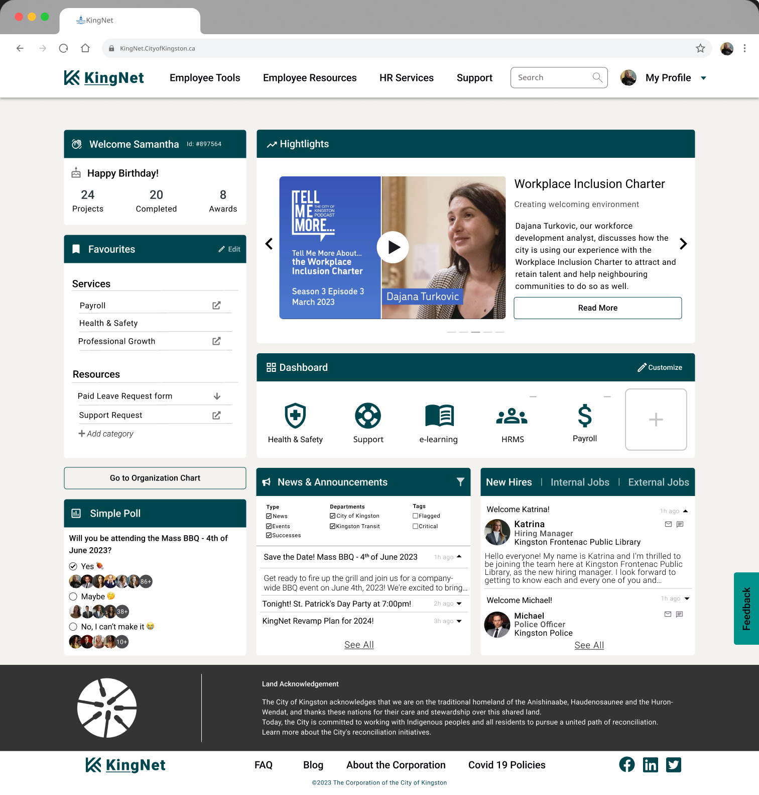
Welcome Widget
A personalised greeting including the employee's name, ID and personal achievements — creating a sense of belonging.
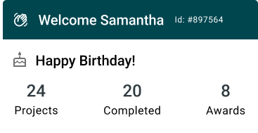
Favourites
Employees can add links to their most frequently used resources with custom category names.
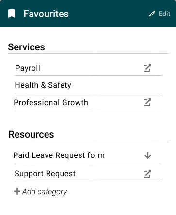
Link to Organisation Chart
Quick access to contact information for colleagues and team members.

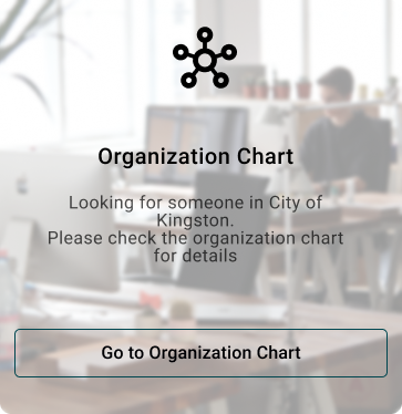
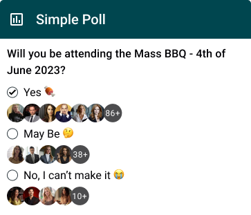
Polling
Quickly assess engagement and gather feedback. Single-question polls can be created with custom choices — participants select with one click.
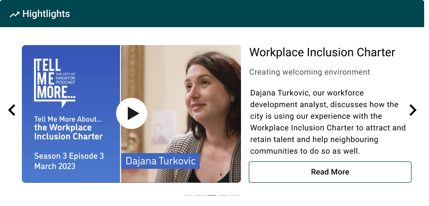
Highlights
A prominent carousel for important updates — images, videos, links — to reduce the chance of updates getting buried in emails. Content is customizable per employee.
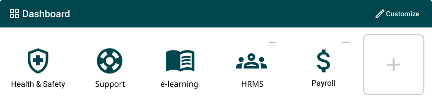
Dashboard
Up to six items: three static items set by the City based on importance, three customisable items specific to the employee.
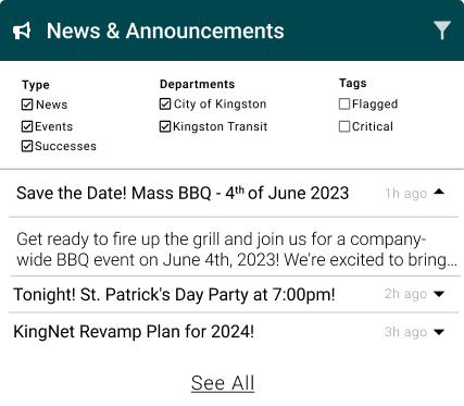
News & Announcements
Latest updates with filtering by type, department, and tags; expandable widget for more information.
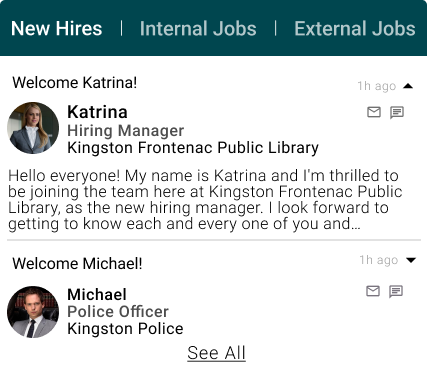
New Hires & Jobs
Tabbed layout to easily see new hires with images, names, self-intros and contact methods — promoting a welcoming, inclusive culture.
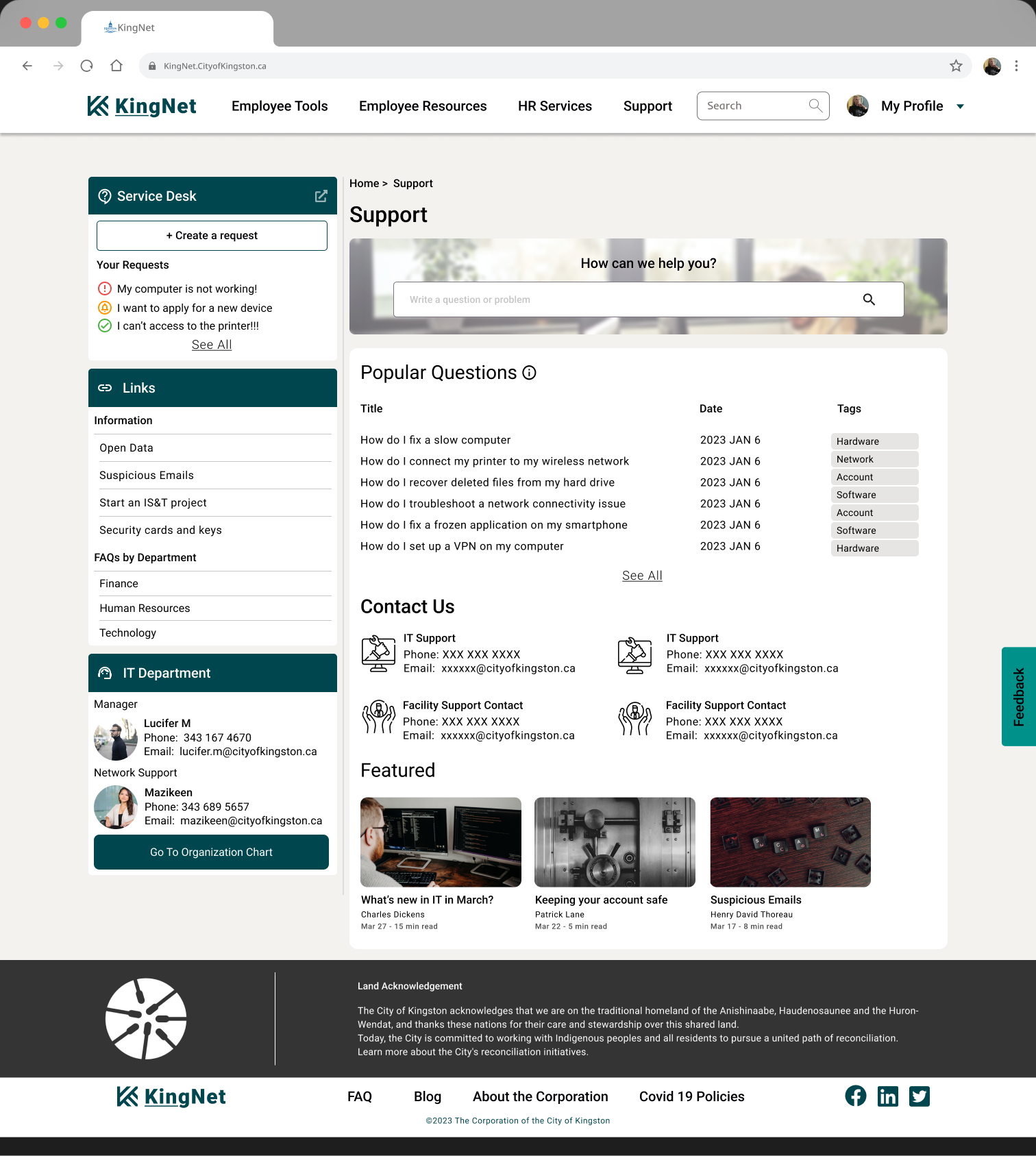
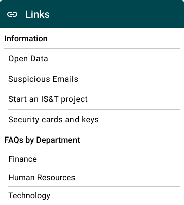
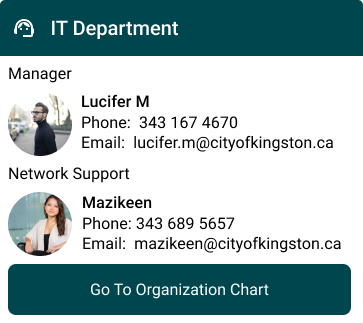
Support Page
The Service Desk widget displays recent requests and a button to directly create a new service request, reducing pages users navigate through. A prominent search lets users find solutions instantly; the featured article sits at the bottom since users in distress prioritise solutions over reading.
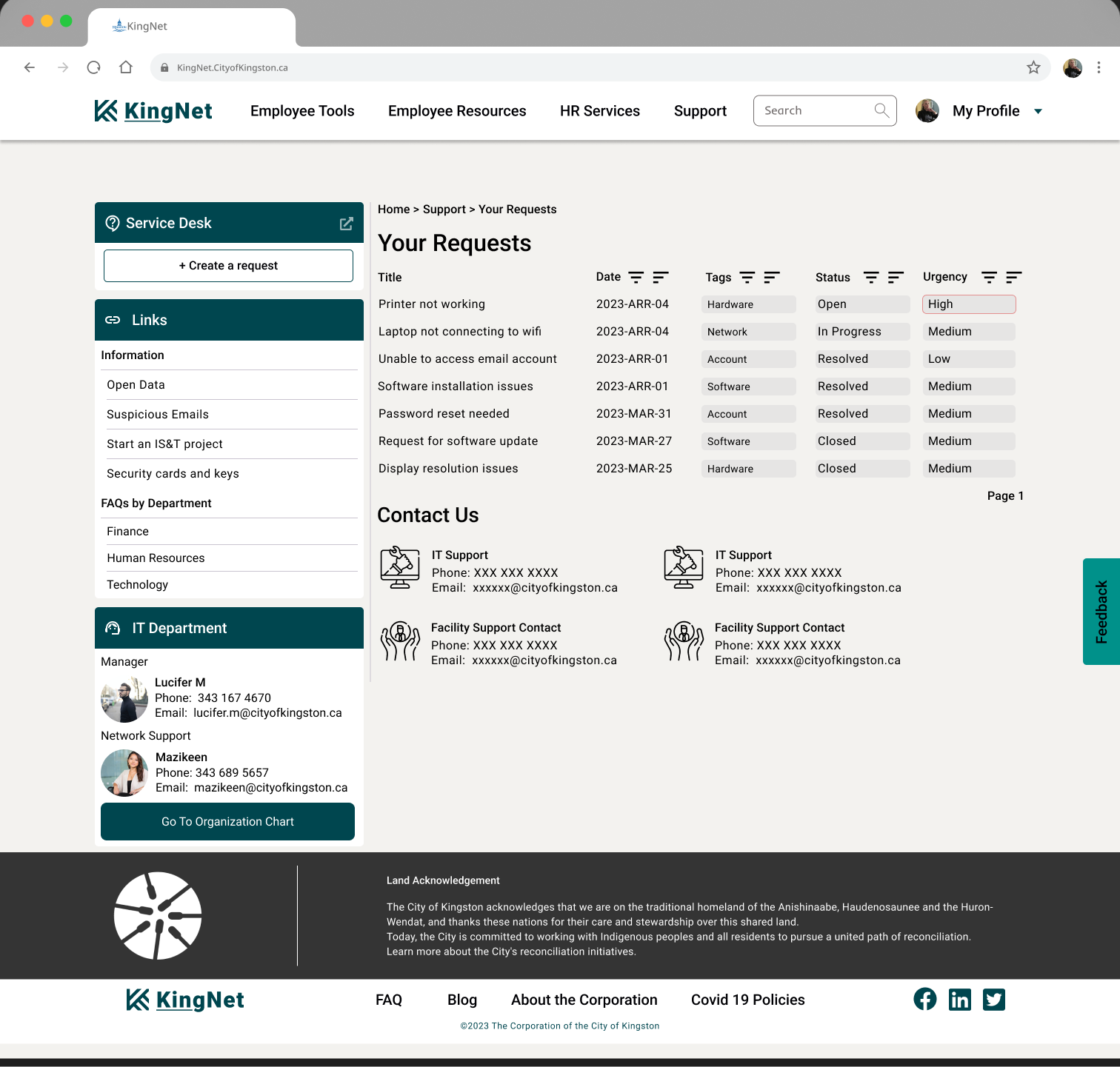
Your Requests Page
Track service request history, differentiated by dates, status and urgency.
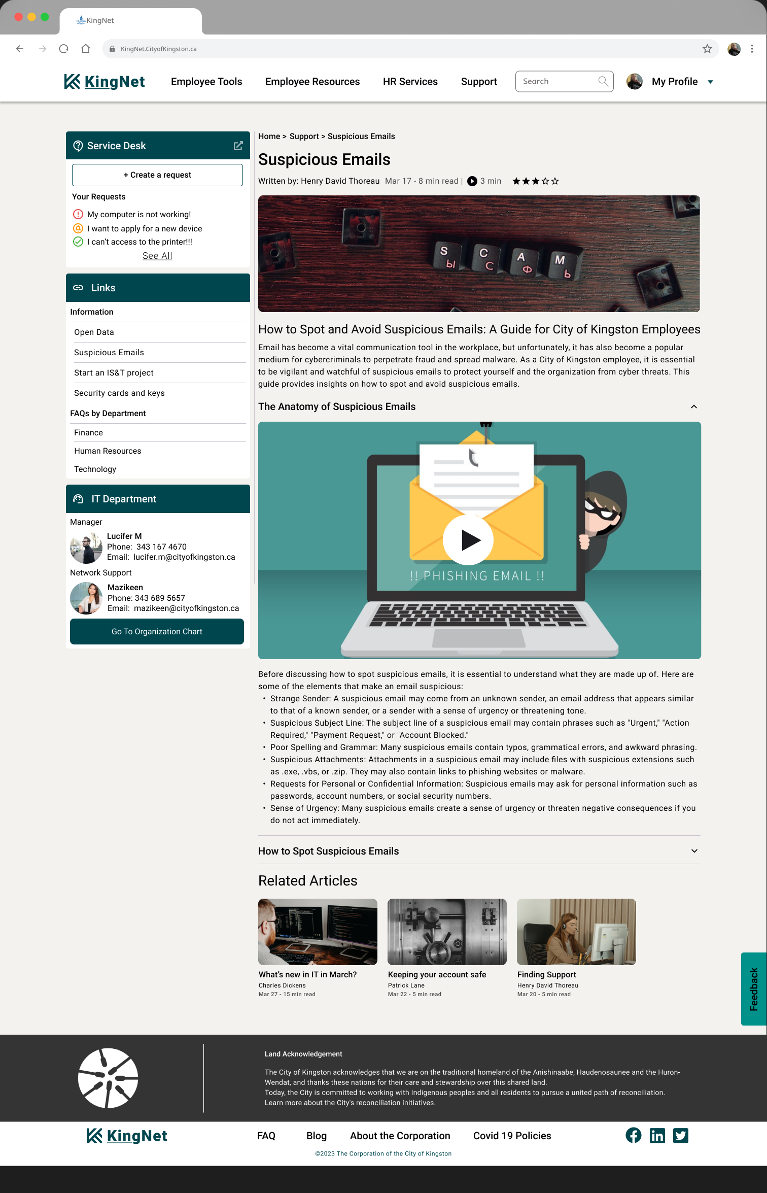
Article Page
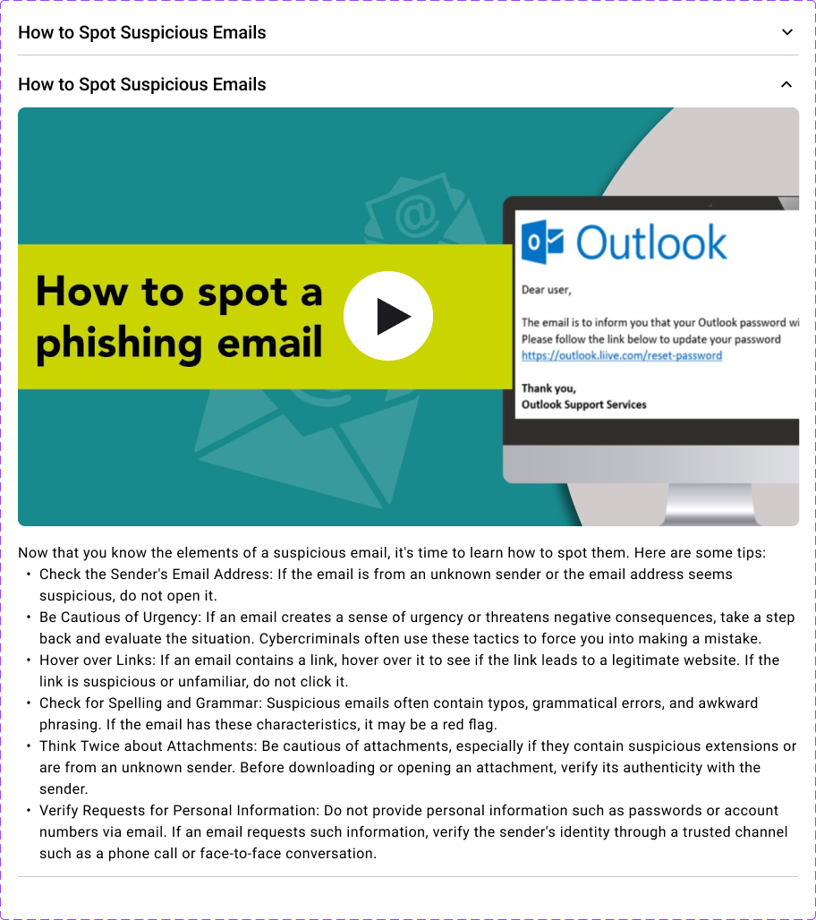
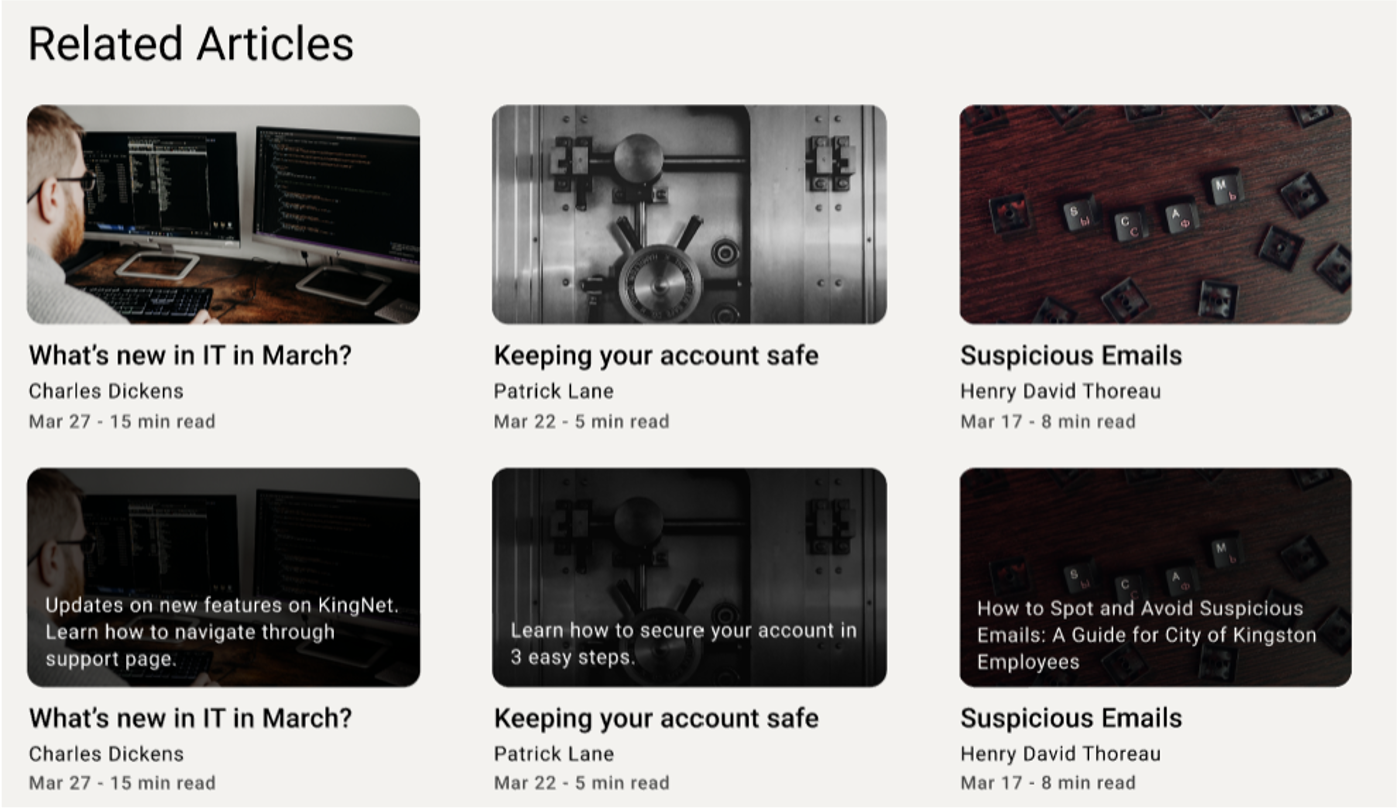
Provides informative content in an easily digestible format — author, estimated reading time, available media, and a rating system. Multimedia content lives in collapsible sub-sections; related articles increase engagement and help resolve user issues.
Client Feedback
- Confirmed their thoughts about the direction of new KingNet
- Helped them understand employees' needs; surprising findings reduced their biases
- Happy with the improved process for accessing the create request page (one of the most used functions)
- Product owners happy with the modern, organised, clean landing page layout
Conclusion
I practised consolidating client requirements, analysing data from surveys/interviews/feedback, designing pages from scratch, and making decisions balancing business and user expectations. The most challenging aspect was striking that balance — especially for frontline workers. We overcame it by extracting maximum value from each interview. I particularly enjoyed seeing how feedback transformed the design across iterations.
Reflection
- Group project — would break design into smaller pieces rather than big batches
- Data was limited due to meeting scheduling; wanted more frontline-worker feedback
- Feedback sessions could have been improved with deeper involvement
- Missed some deliverables in the evaluation phase
- Designed well with limited input — clients and interviewees were generally happy