Individual Project
Trillium Bus Lines
Bus ticket booking website for an Ontario-wide service
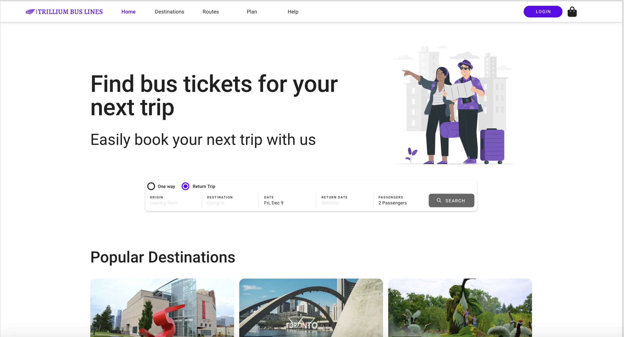
Background
An Ontario-wide bus line with established routes along the Québec City to Windsor corridor (and points in between), filling the gap left when Greyhound pulled out of Canada. This is a school UX Design project — Trillium Bus Lines is a fictional company. Supervised by Ronil Upadhyay (project manager for feedback).
Project Goals
Understand business goals and design a website to accommodate the new bus line. Project covers research, design, and a high-fidelity interactive prototype.
- Increase ticket sales — easier self-service ticket discovery and purchase; emphasise the Québec–Windsor corridor
- Promote brand image — return customers and broader exposure; provide service information
- Reduce operation cost — self-service ticketing, FAQs; reinvest savings into seats, routes, and community value
Research — Persona
Three potential personas were considered: Students (low budget, holidays, with friends), Business Travelers (time = money, work while commuting), Backpackers (adventure, get on the next bus). The project focused on the Business Traveler persona due to scope.
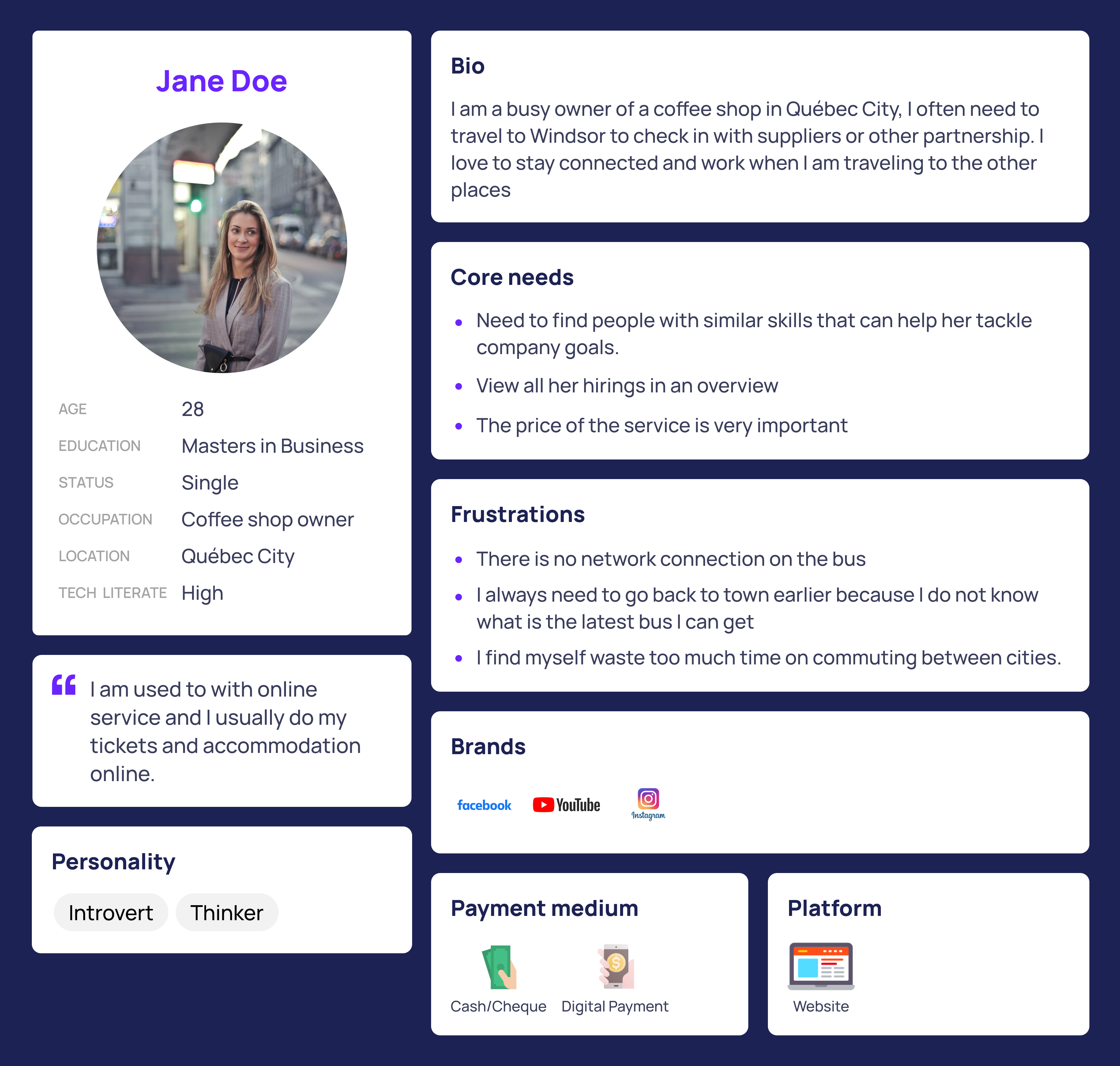
Scenario
Jane Doe is a busy businesswoman who owns a coffee shop based in Québec City. She needs to travel to Windsor by bus (not a fan of trains) before a pop-up store event. On the way back she prefers to maximise her time, working on her laptop on the bus to Québec City.

Competitor Analysis
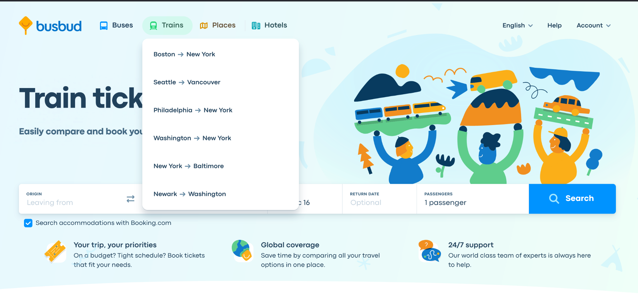
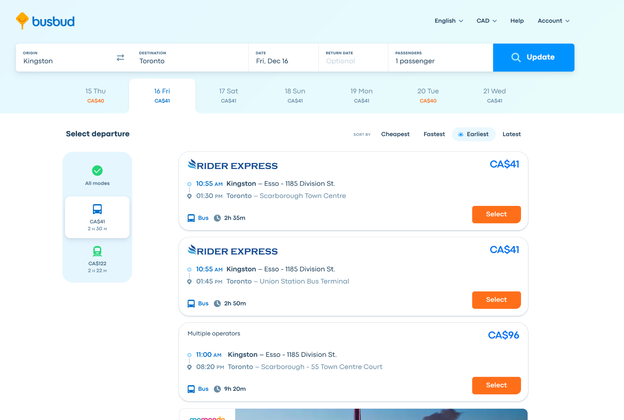
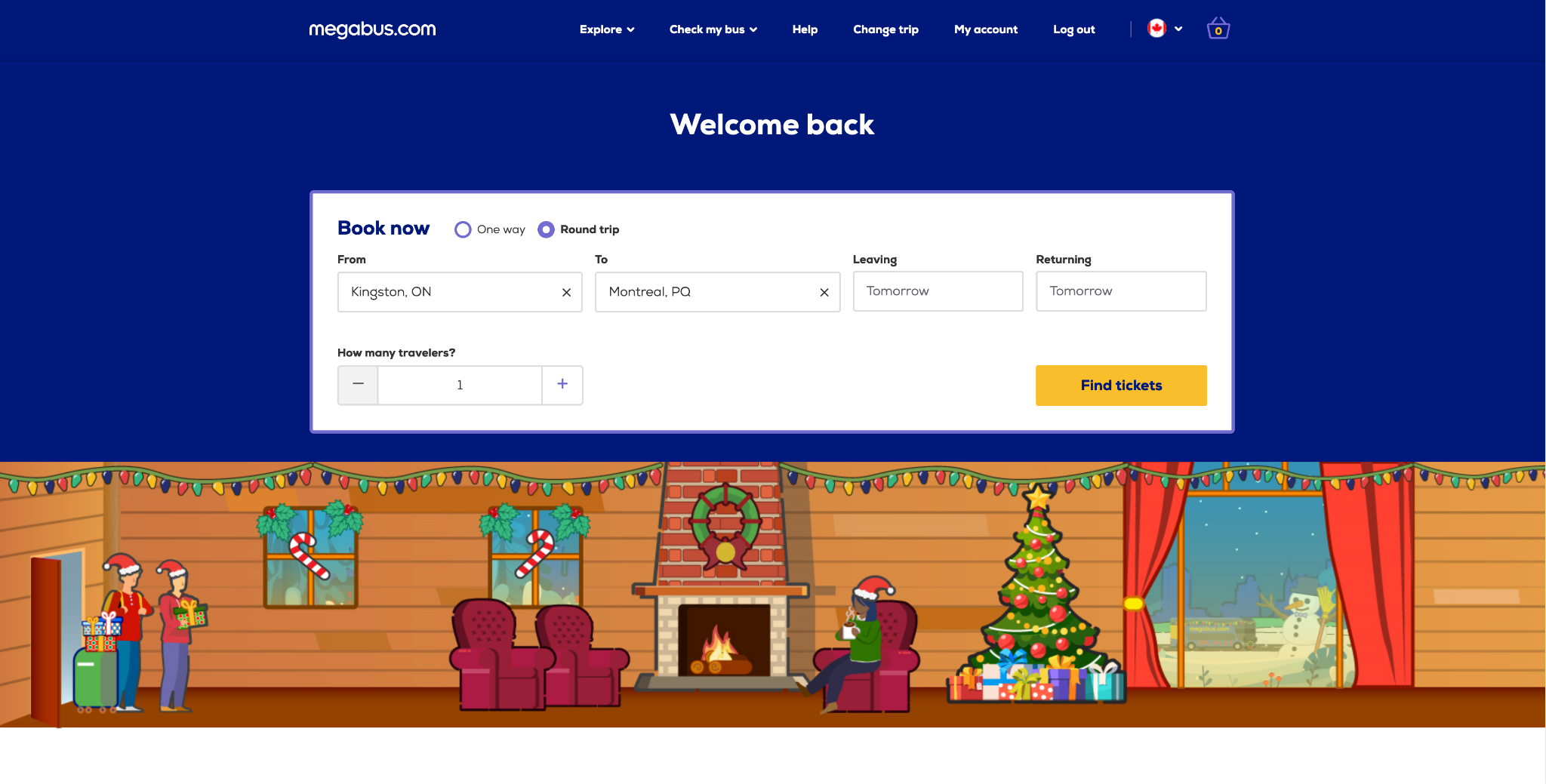
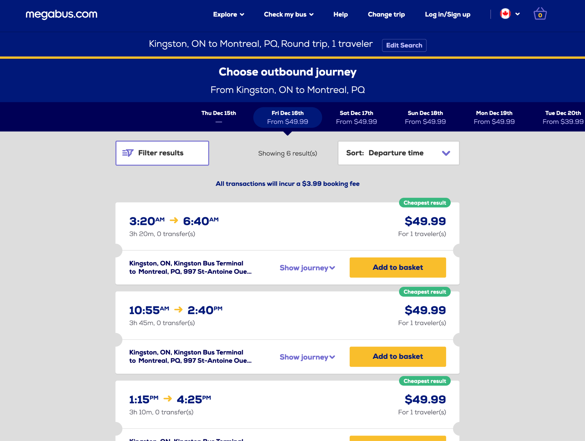
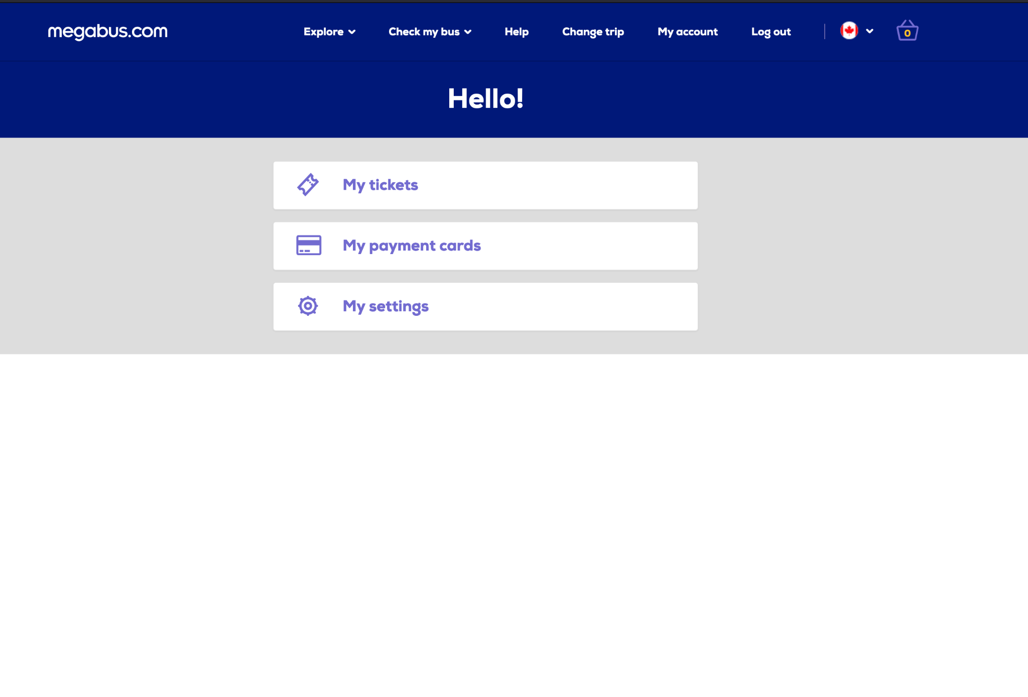
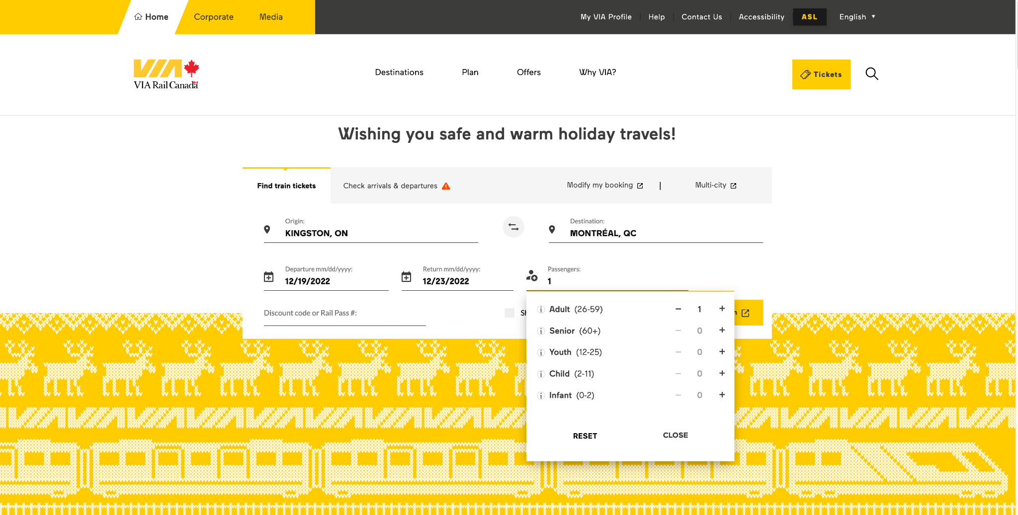
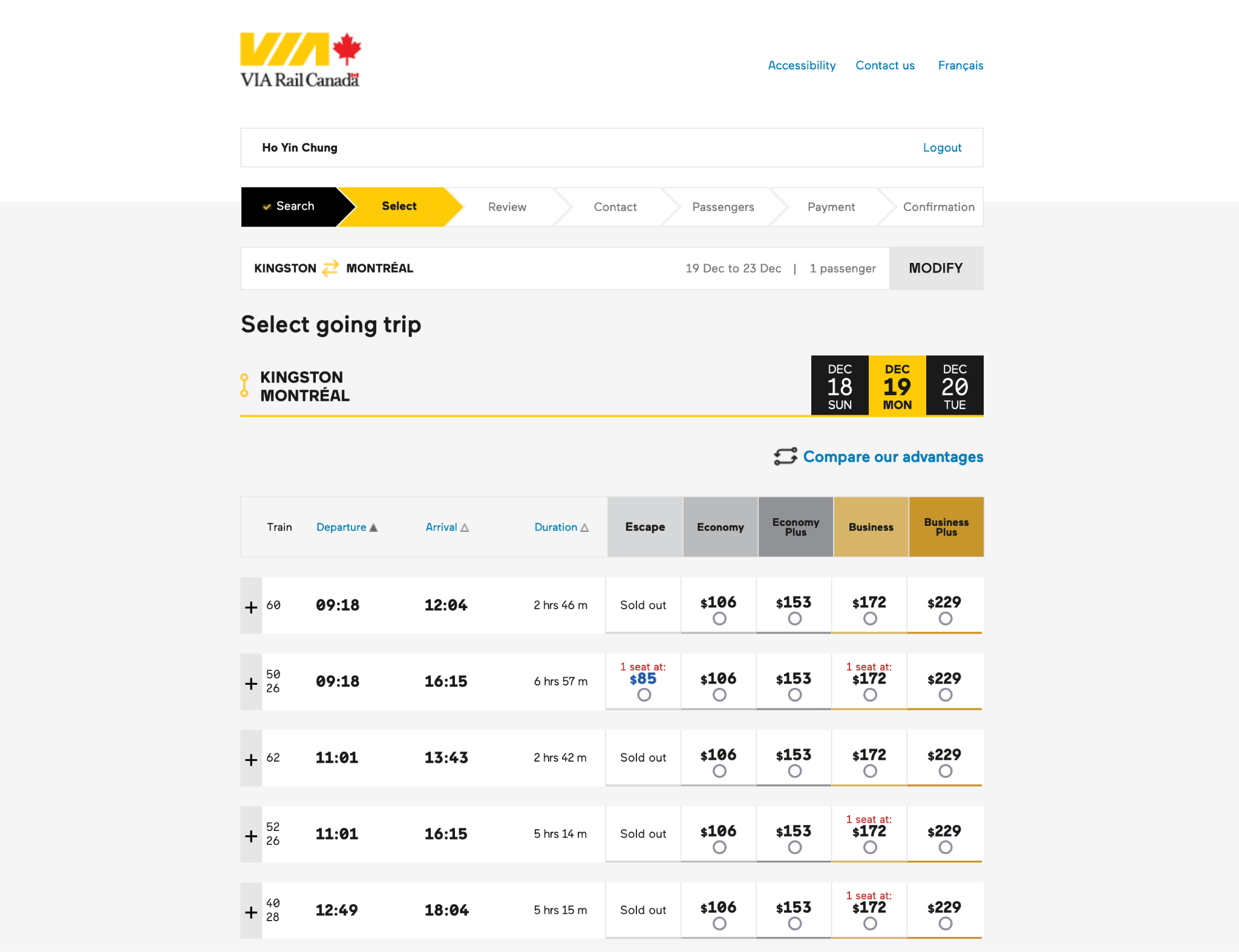
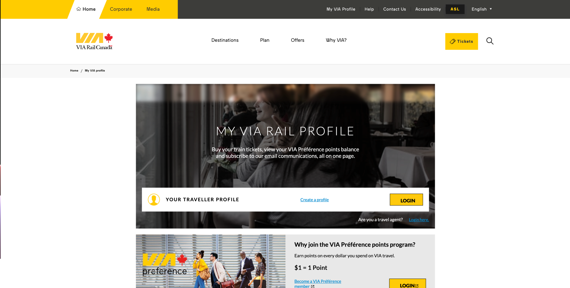
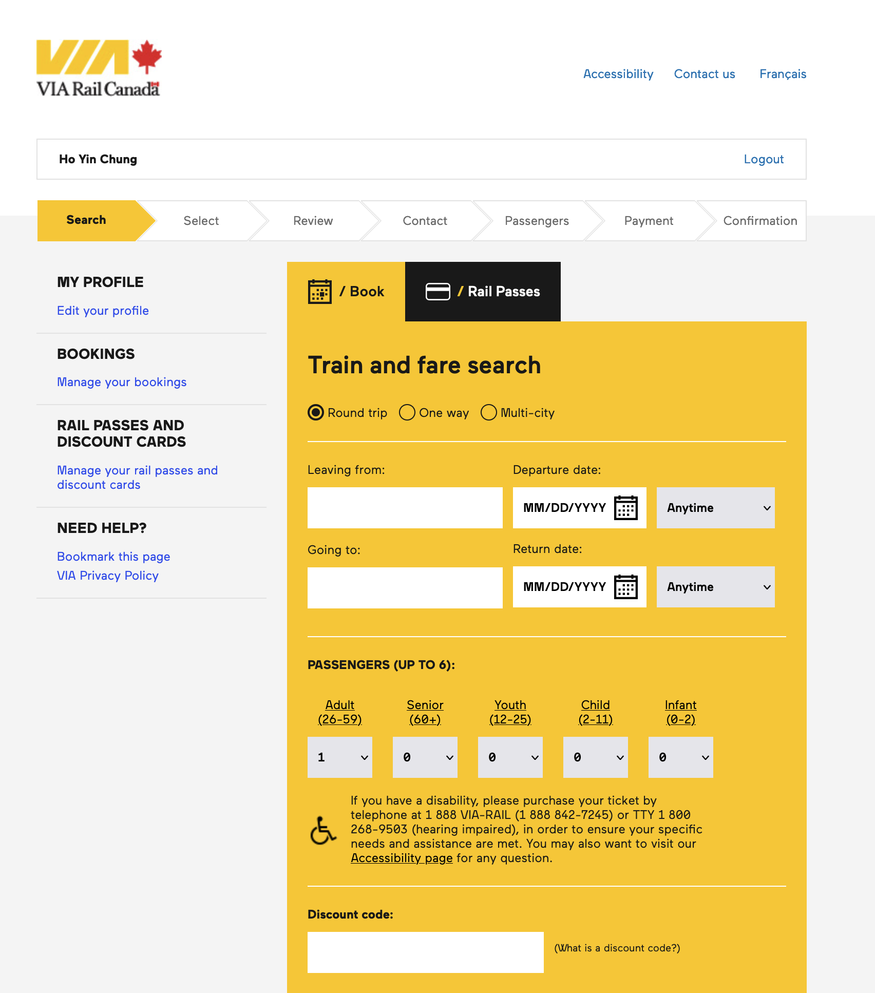
I visited similar sites to understand positioning and trends — creating accounts, searching for tickets, and going through purchase flows up to the payment step. Criteria: features, home page, payment flow, search ticket flow, my account, layout, IA.
Busbud
Third-party reseller that aggregates bus providers.
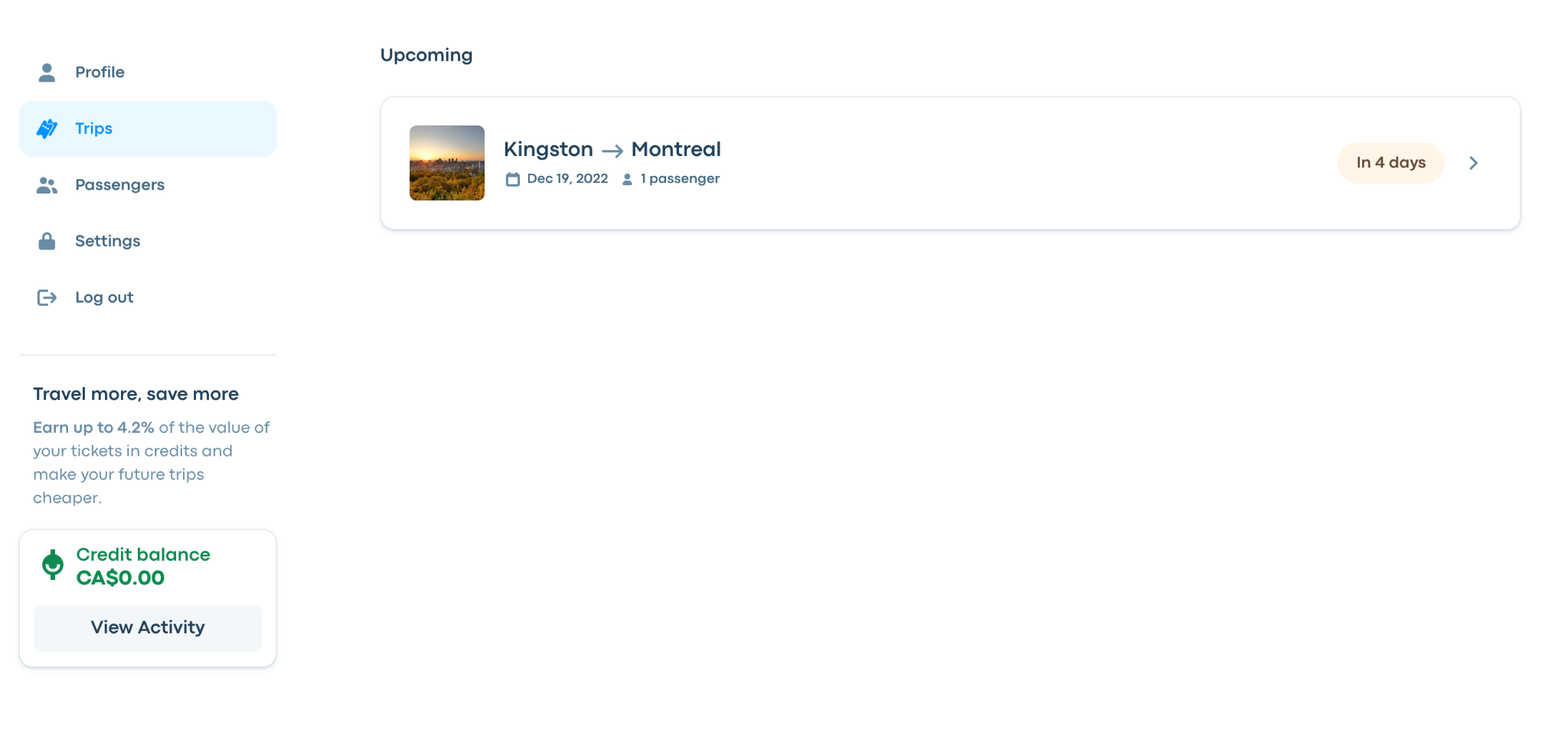
Megabus
Operates their own buses and sells tickets directly.
VIA Rail
Canada-wide train service used as a transport-flow benchmark.
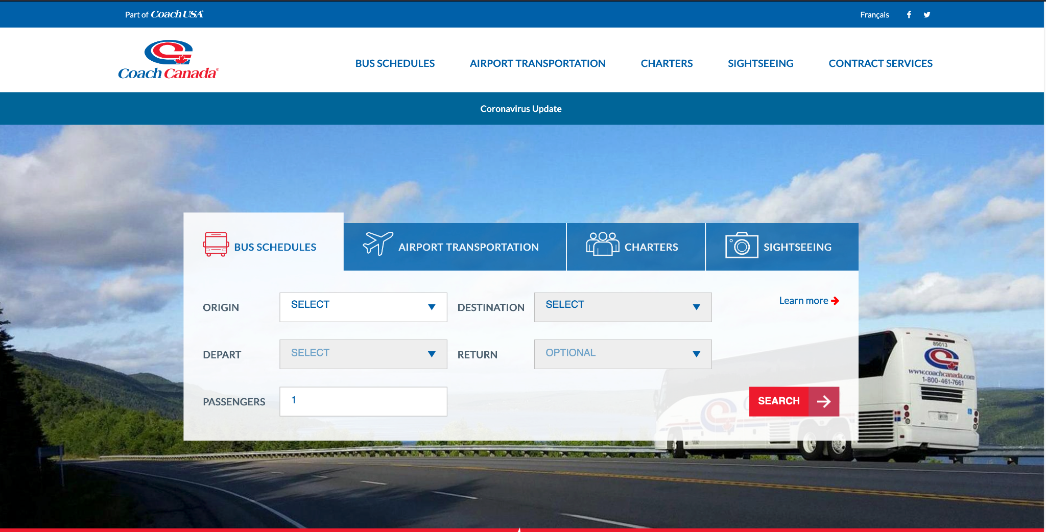
Coach Canada
Service-introduction site that redirects to the actual provider for ticket purchasing.
Opportunities
- Search box as the central component — date picker, trip options, passenger picker
- Two flows: select & single-process per trip + add-to-cart for multiple trips
- Clean vs detailed home pages — choose a minimalist hierarchy with clear navigation
- My Account page on the same site with two-panel layout, capped at two levels
- Checkout — collect passenger info for guests; encourage login pre-checkout
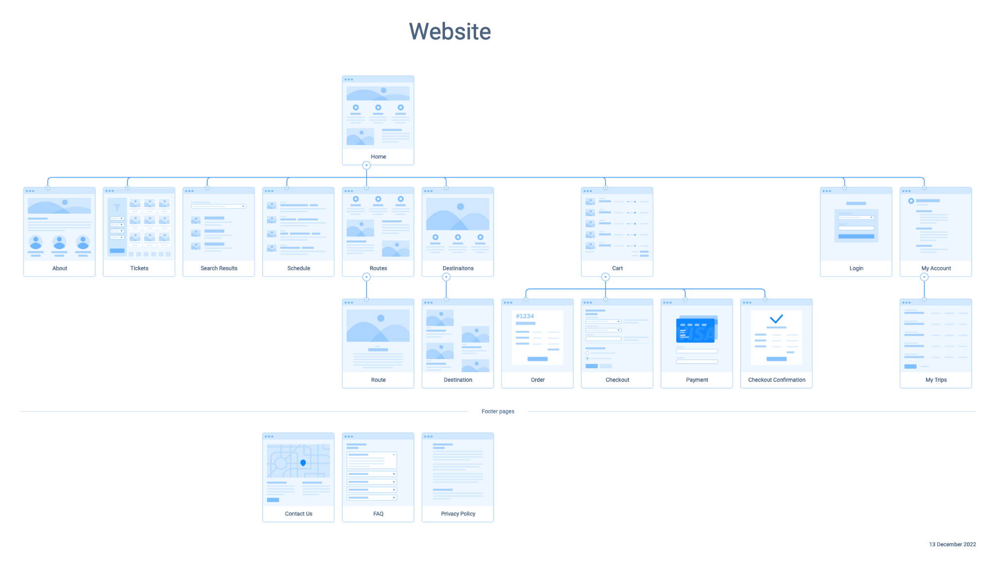
IA Diagram
IA built from common competitor terminology and navigation patterns.
Design Patterns & Guidelines
Followed Atomic Design (bottom-up component composition), Material Design V3 (Google's adaptable system), and checklist.design to track design progress and cross-check elements.
Low-fidelity Prototype
Focused on components, page layout, and interactions. Colors for buttons; placeholder text (e.g. "CITY") to reduce cognitive load. Unique button shapes emphasise distinctness.
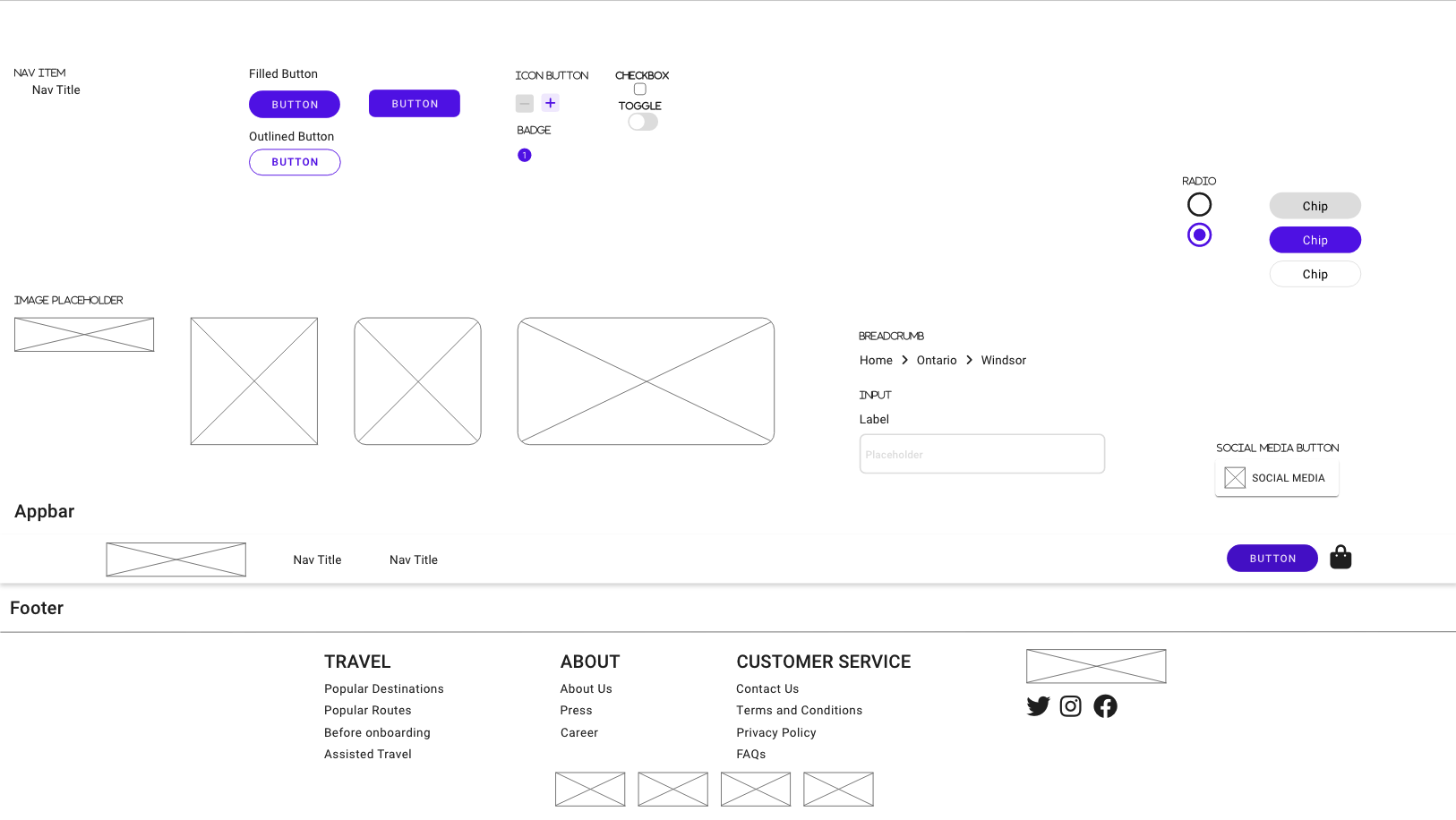
Base Components
Foundational pieces — navigation items, buttons, checkboxes — and layout components like the Appbar and Footer.
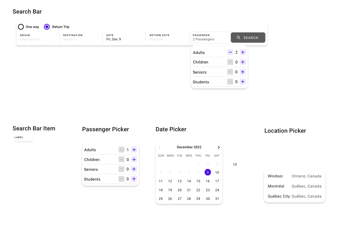
Search Bar Components
Grouped for fast discovery and reuse. Dynamic content with auto-fill; depart/return dates synchronised.
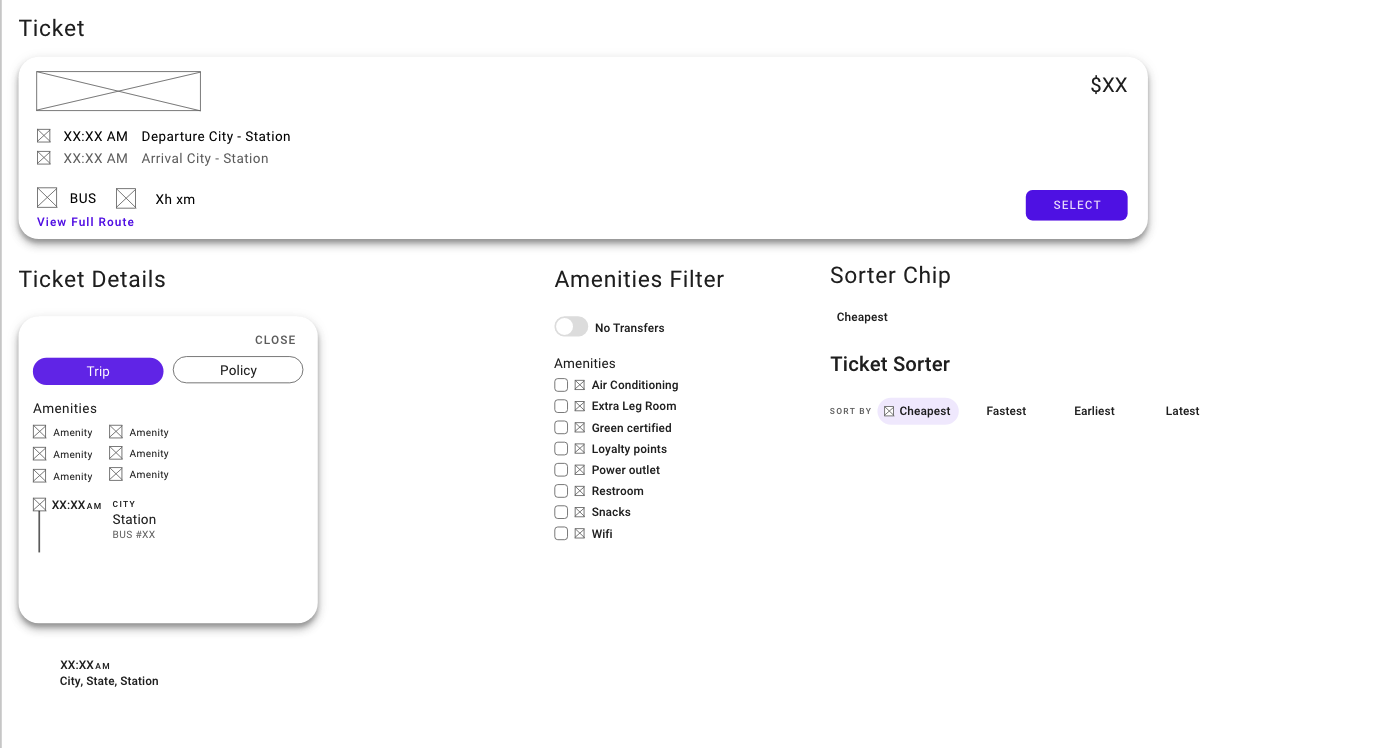
Ticket Components
Custom components for result pages, shopping bag, and My Trip pages.
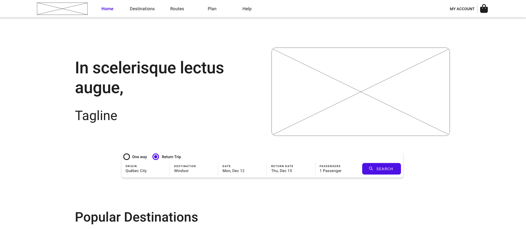
Home Page (low-fi)
- Search Bar element
- Origin/destination picker
- Date input
- Popular Destinations
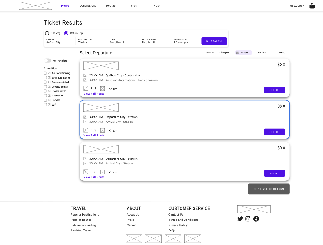
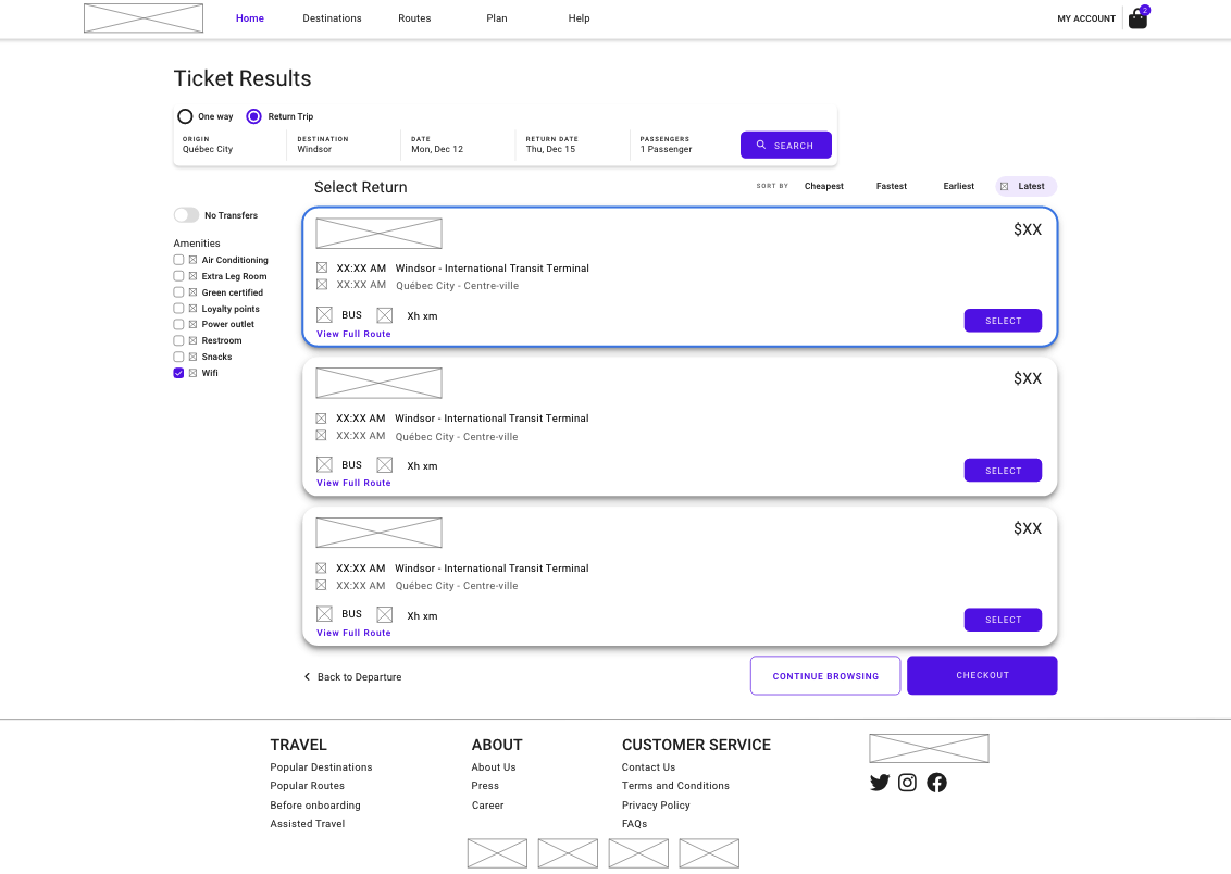
Search Results (low-fi)
- Filter on left: transfers & amenities
- Sorting chips on top: cheapest/fastest/earliest/latest
- Price, time, duration & route per bus
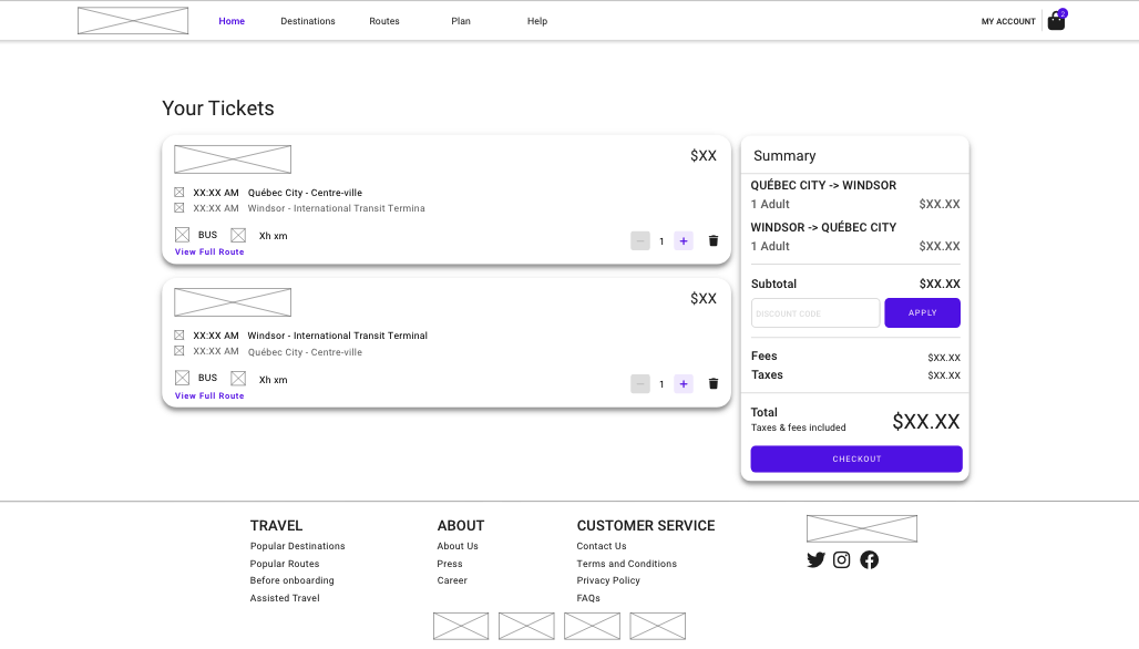
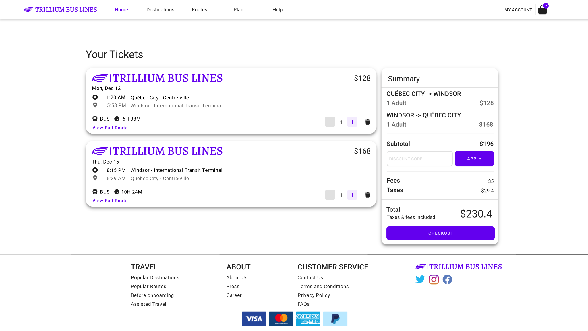
Shopping Bag (low-fi)
- List of tickets
- Edit number / remove
- Promotion code
- Subtotal, taxes, total
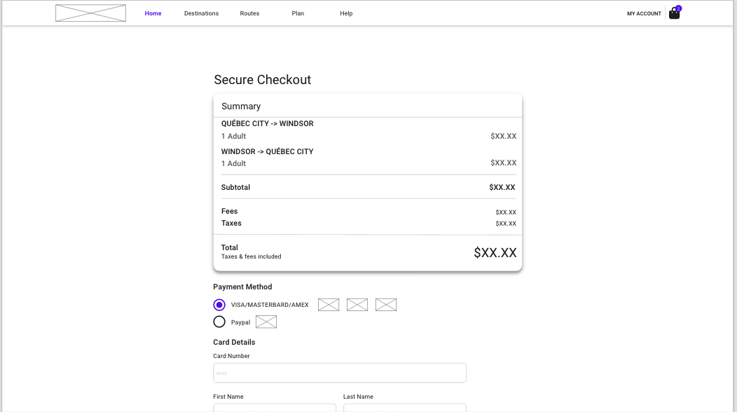
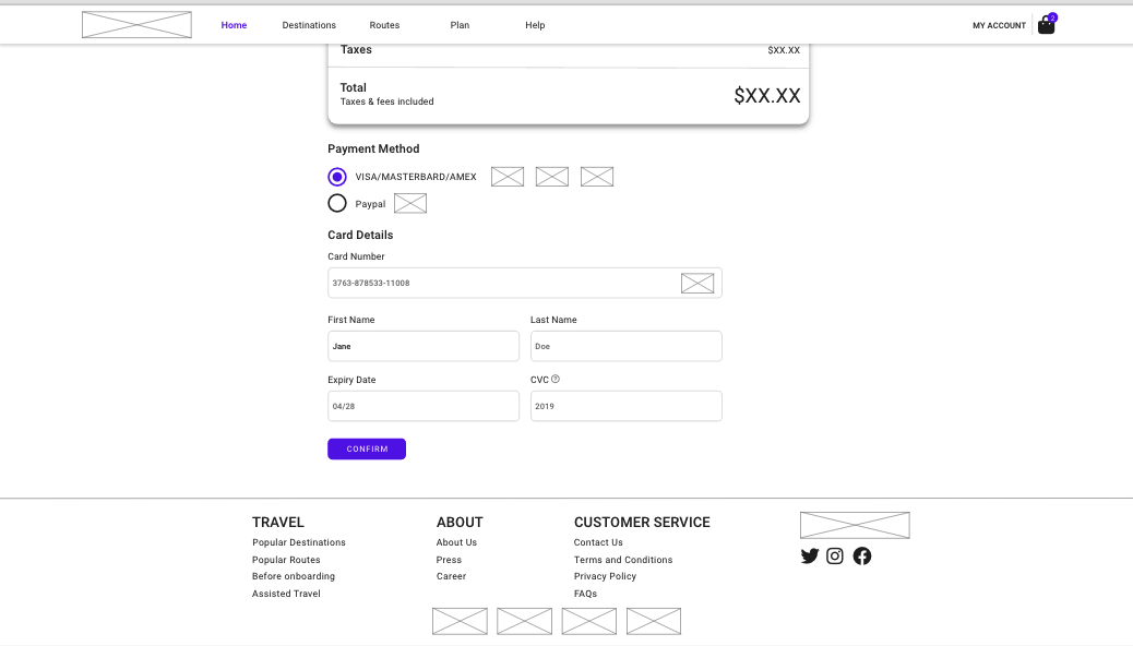
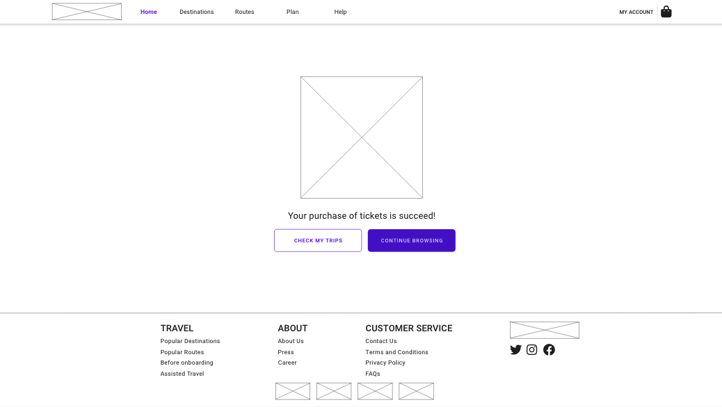
Checkout (low-fi)
My Trips (low-fi)
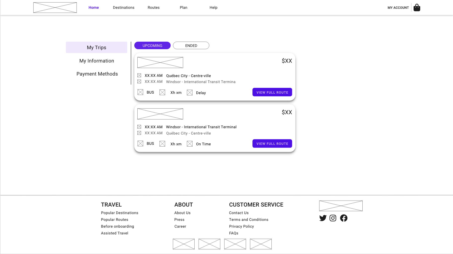
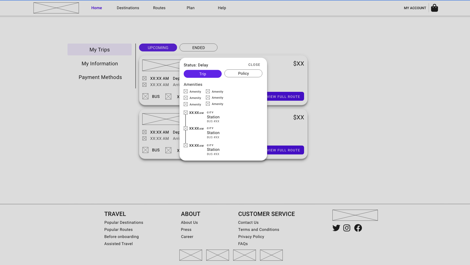
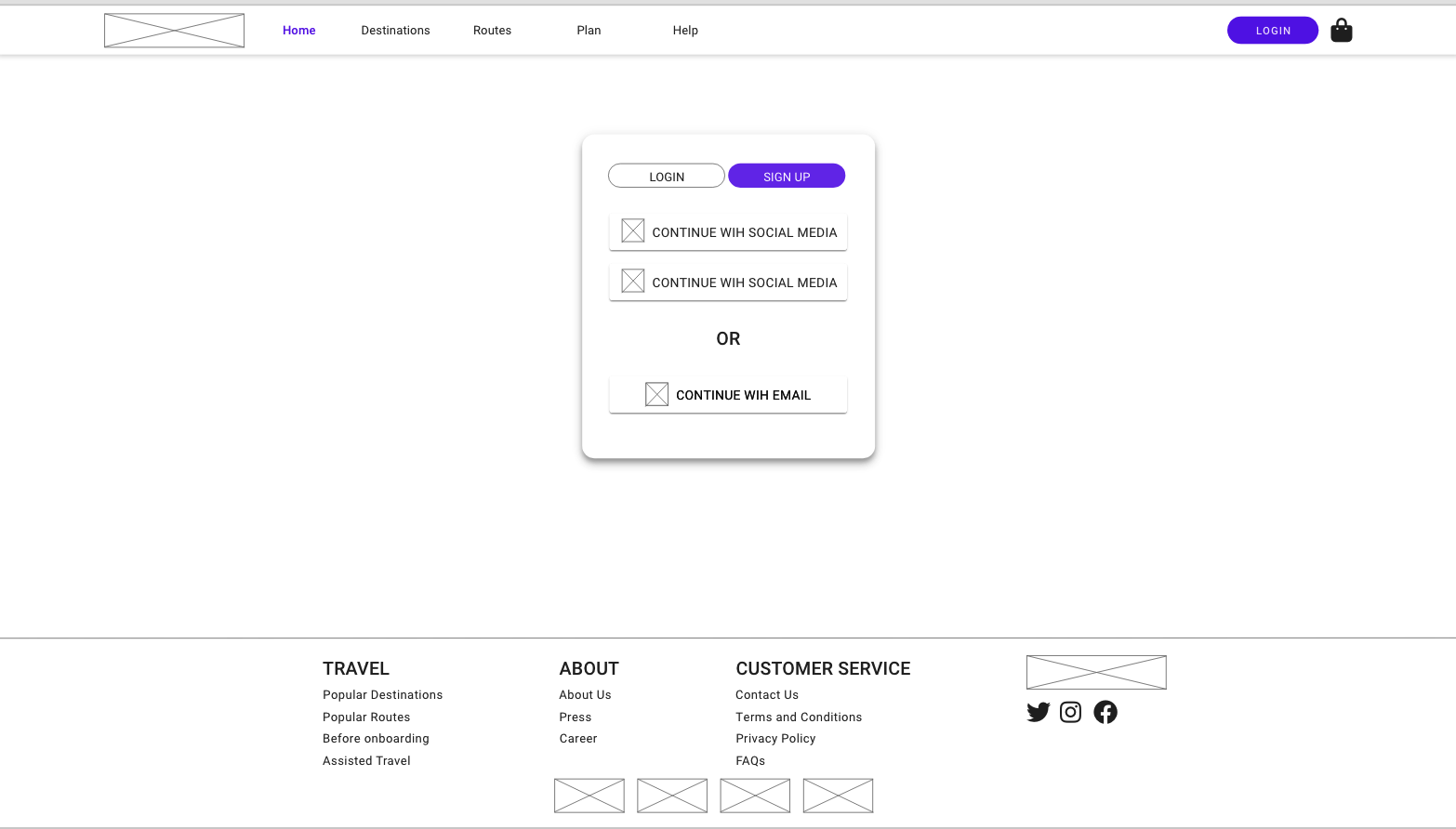
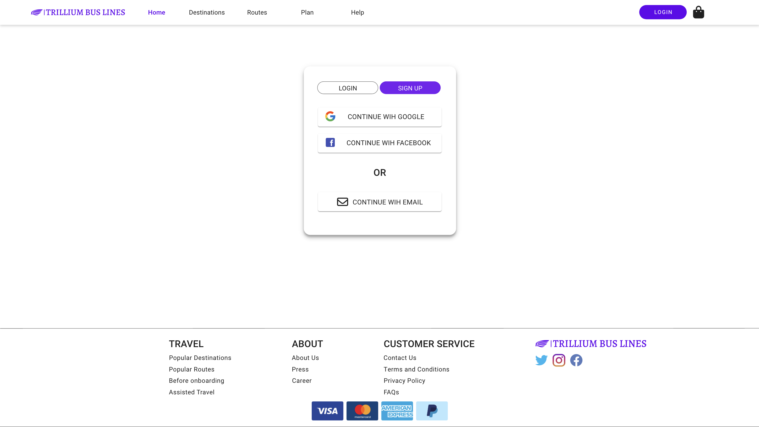
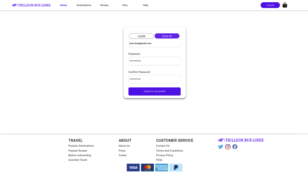
Create Account (low-fi)
Login/signup with SSO methods or email.
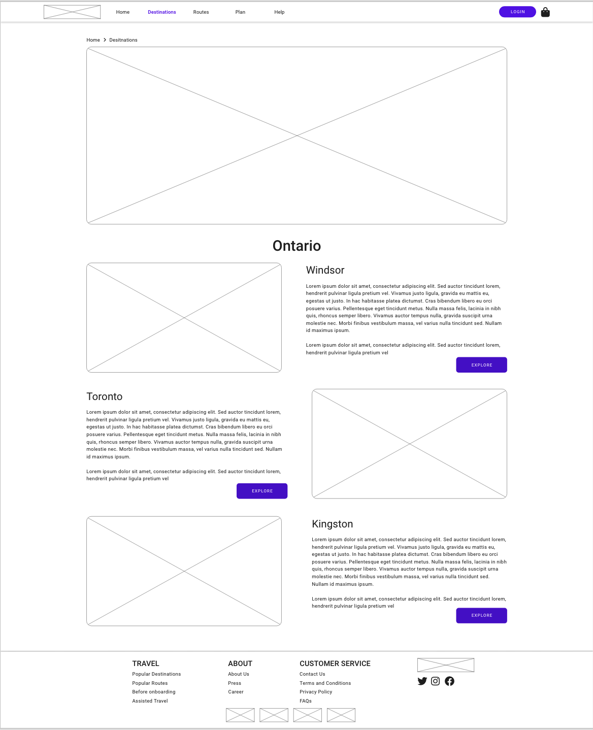
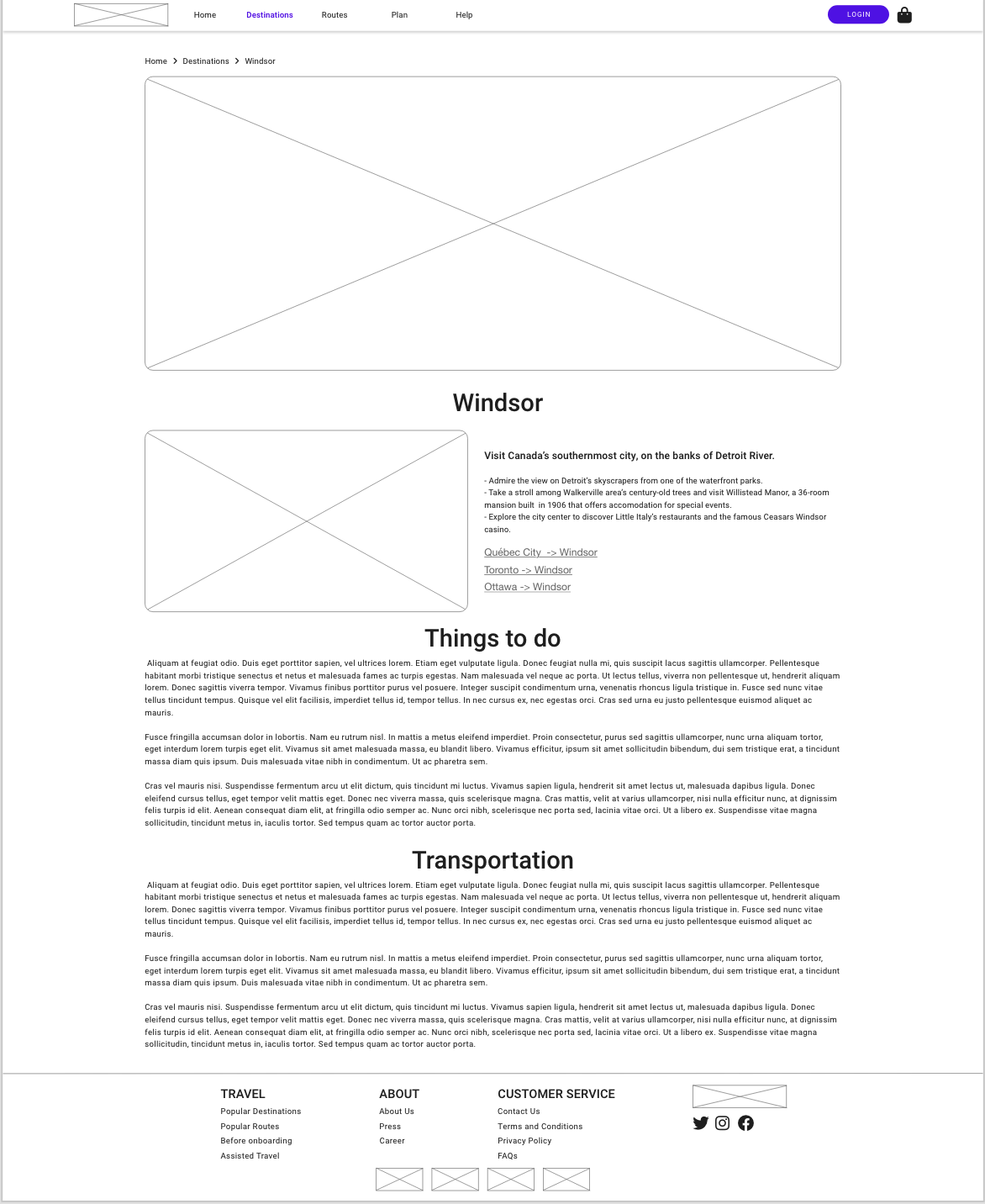
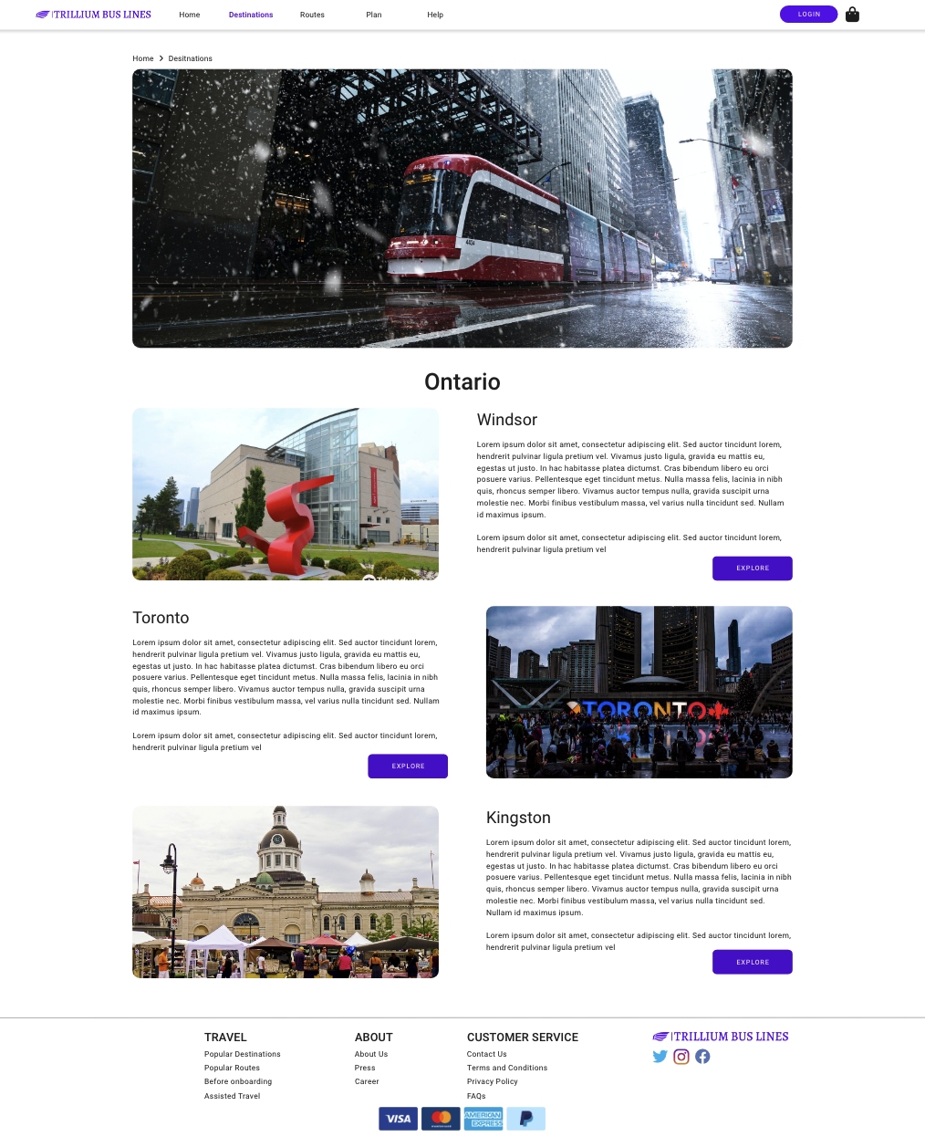
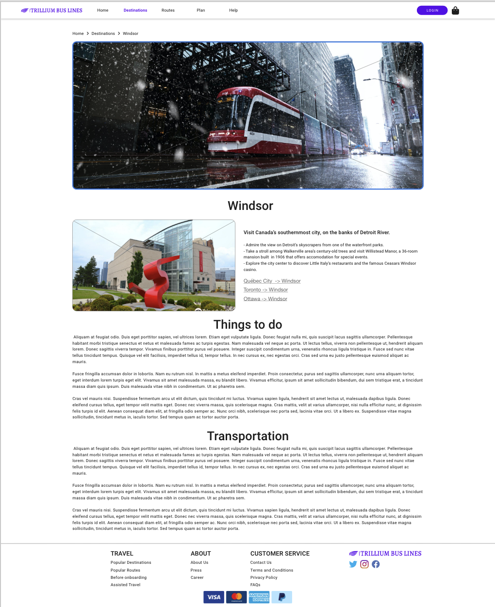
Destinations (low-fi)
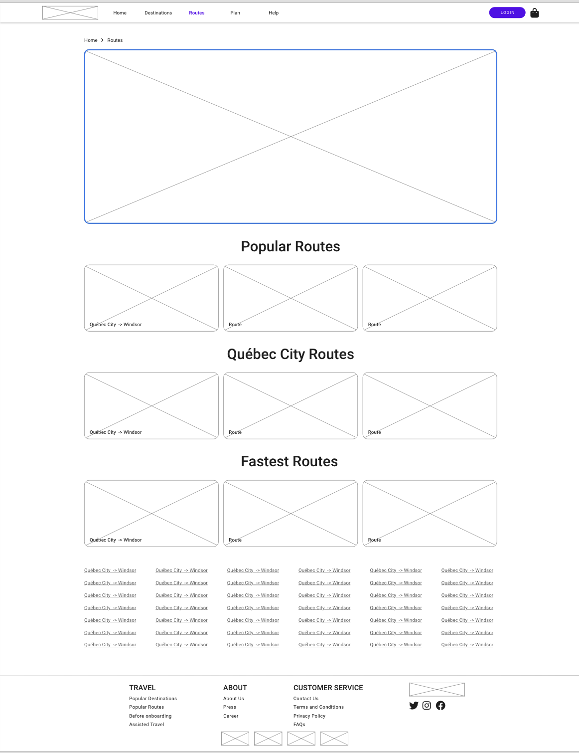
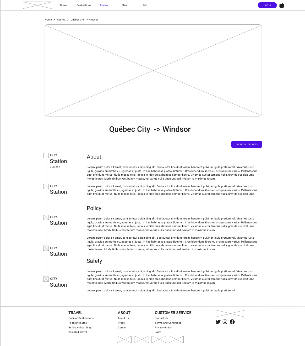
Routes (low-fi)
User Testing
Low-fi prototype used to keep focus on the user story, not styling. The persona and scenario guided tasks. One participant — a frequent flyer friend — completed a 10-step flow from searching for tickets to purchase.
Testing Results
- Destinations page cannot search directly — should default to current location and search automatically
- Some filtering/sorting did not perform as expected
- Payment step was clean and straightforward
- Create account had too many steps
- The logo navigated to the wrong page
High-fidelity Prototype
Refined colours, styling, and element placement with attention to detail. Lorem ipsum for large text sections; relevant images replace placeholders. Focus: searching tickets and purchasing as a logged-in user.
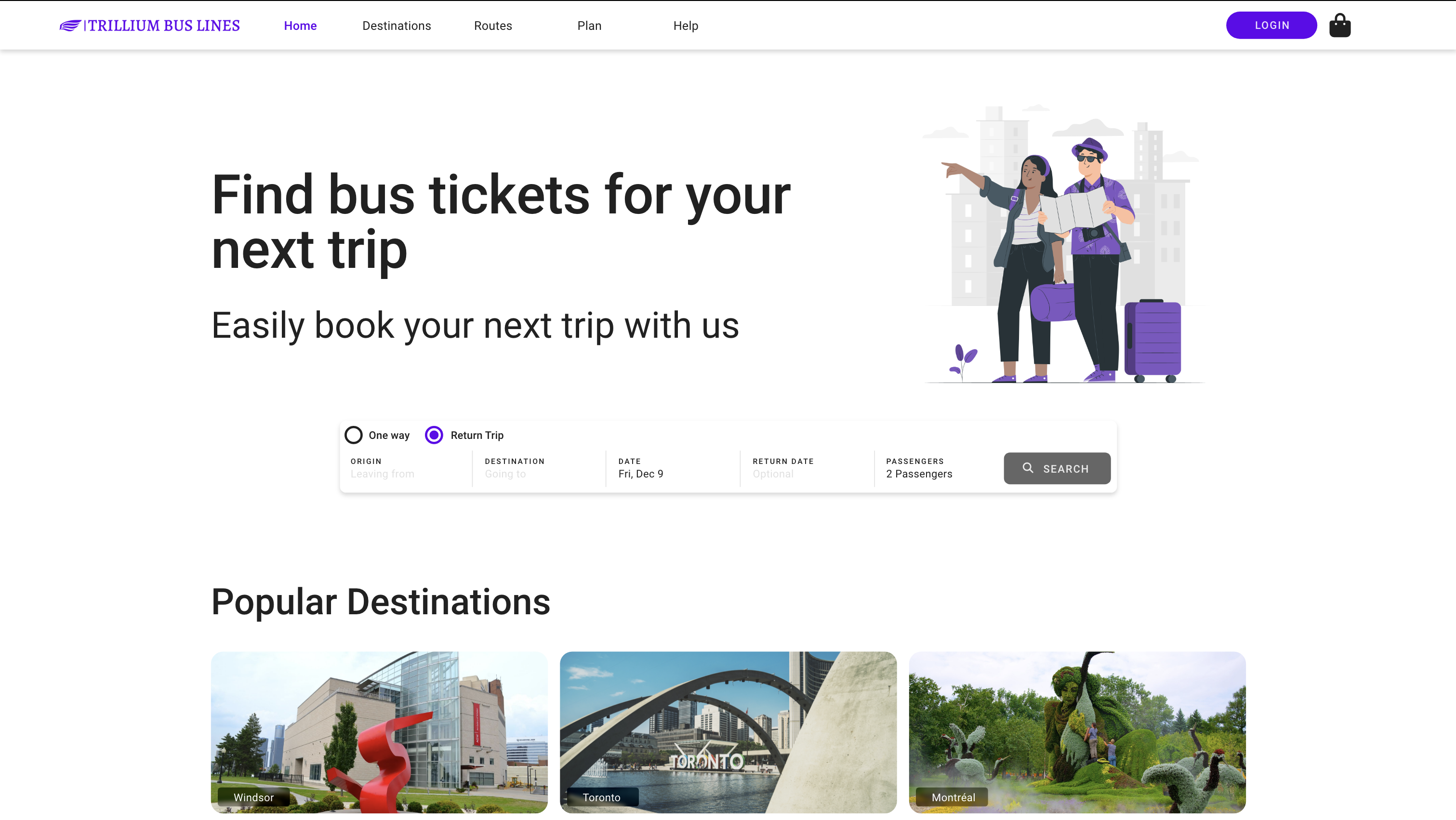
Home Page (high-fi)
- Headline and tagline for brand value
- Search bar as the first noticeable item
- Single / return trip toggle
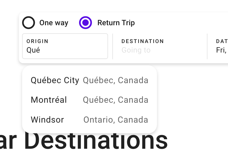
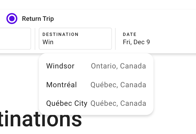
Origin & Destination Pickers
- Suggest places
- Auto-completion for error prevention
- List capped under 10 items
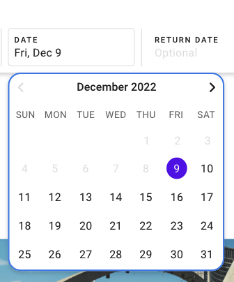
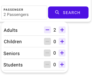
Date & Passenger Pickers
Shopping Bag (high-fi)
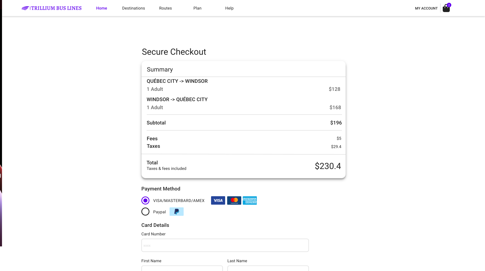
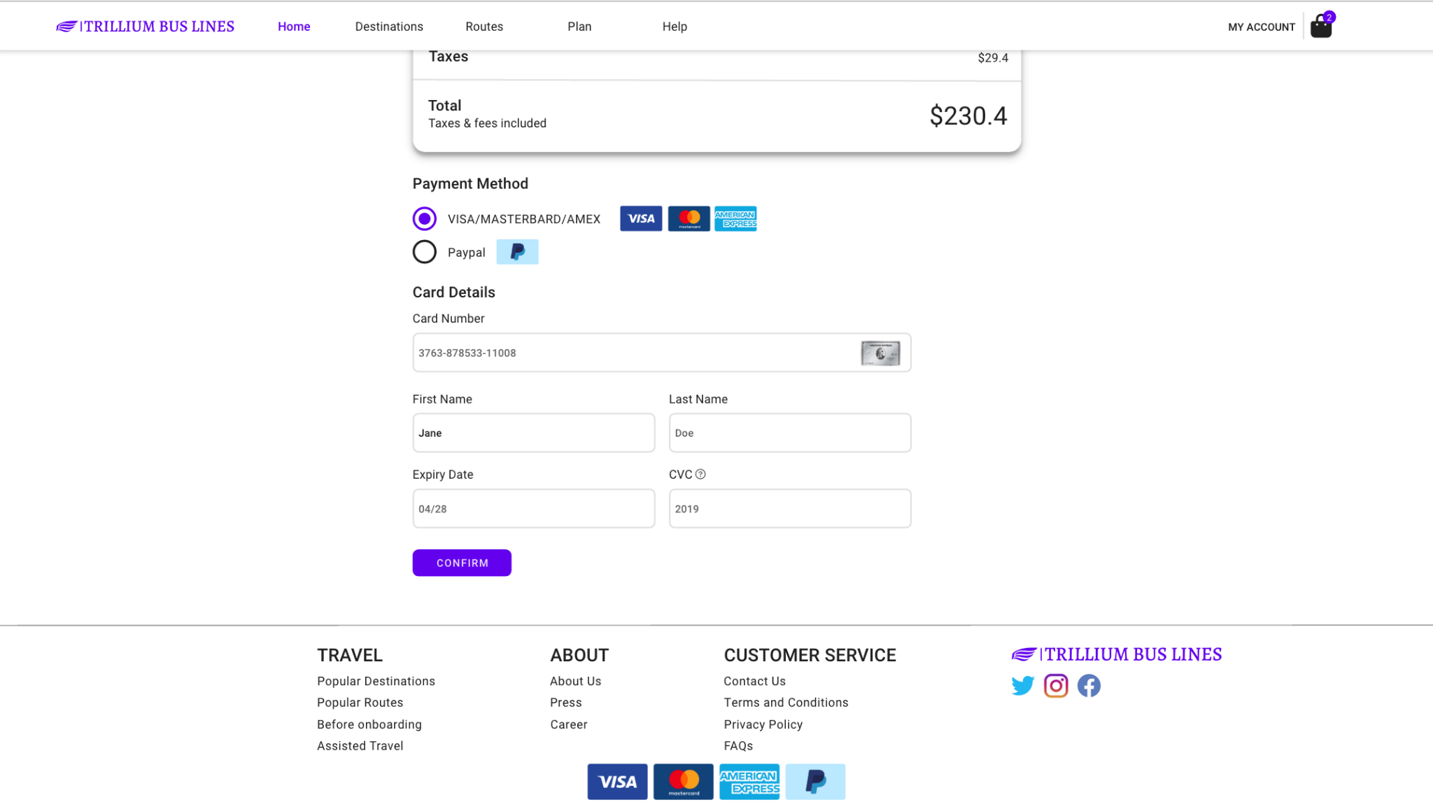
Checkout (high-fi)
- Error statuses on input fields
- Card and payment-method imagery
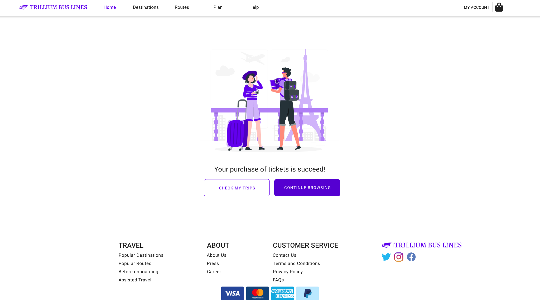
- Relevant success-page image
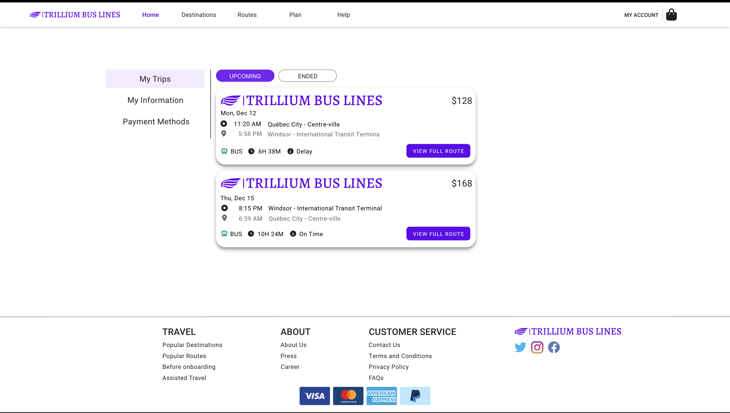
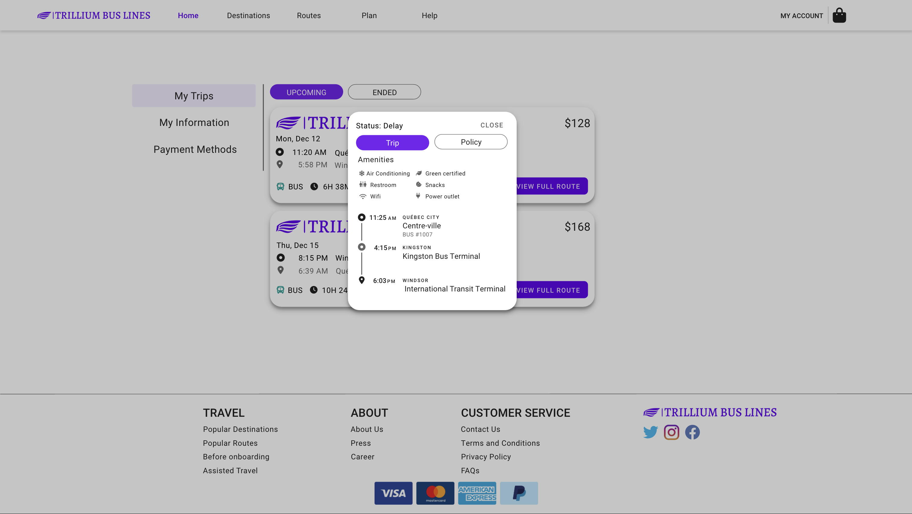
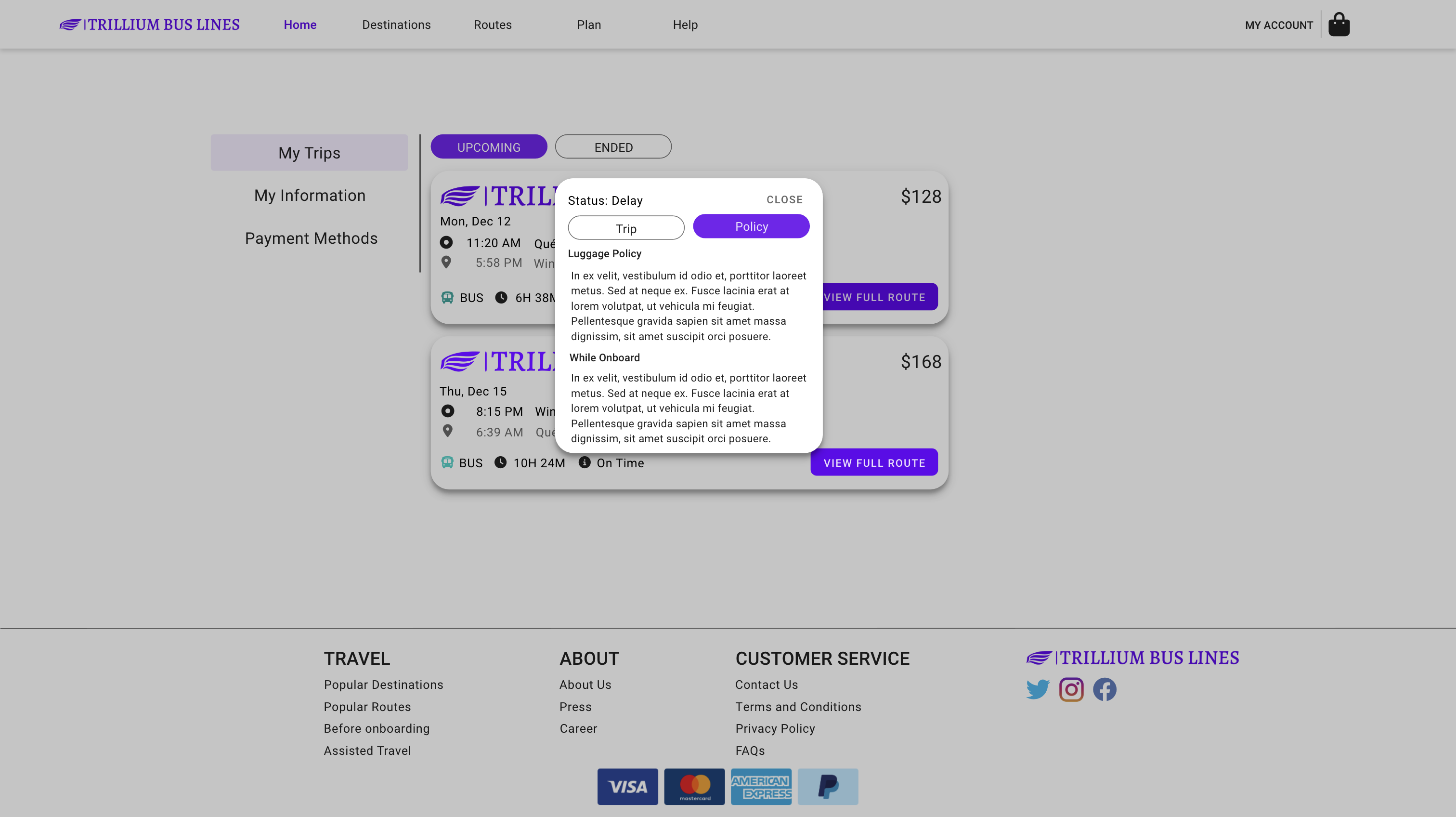
My Trips (high-fi)
- Icons indicate information clearly
- Tab control
- Amenities + detailed route & stops
- Status on top
- Policy details
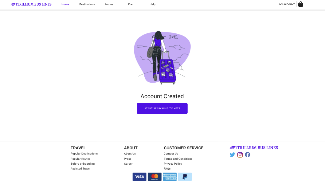
Create Account (high-fi)
- Coloured icons
- Relevant imagery
- Error reporters on inputs
Destinations (high-fi)
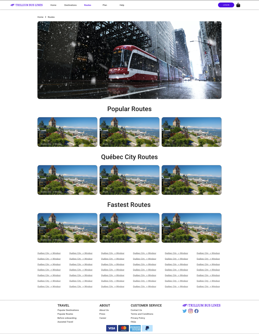
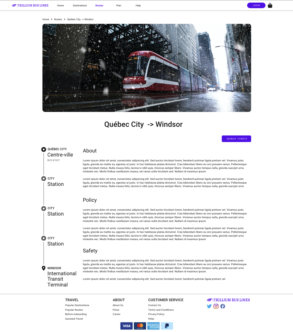
Routes (high-fi)
Conclusion
A full design process from research through evaluation for a fictional company. Since there was no handoff for implementation, the final deliverable was presented in a deck to the project manager.
Reflection
- Research — mostly secondary; given more time would do card sorting, interviews, focus groups
- Process — bottom-up Atomic Design helped pace milestones; spent too much time on low-fi styling — would invest more in user flow next time
- Persona and scenario kept the design grounded in user goals
- Improvements: larger modals on desktop, quick-search button on Destinations, smaller logo on tickets, less whitespace in centralised layouts, richer shopping-bag summary with "you may also like"
Prototype Links
- Low-fi: https://xd.adobe.com/view/489d2779-056e-48e1-85ff-eb9c34703864-1dce/?fullscreen
- High-fi: https://xd.adobe.com/view/2eba8bd0-4748-4d56-9c22-eec1343a880a-7be9/?fullscreen